
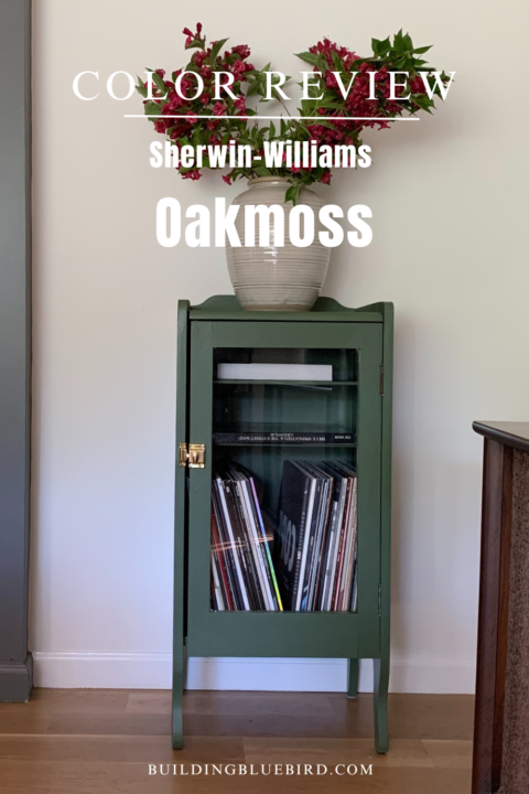
When it comes to selecting the perfect green paint color for your home, Oakmoss by Sherwin Williams stands out as a versatile and sophisticated choice. This rich, earthy shade brings a sense of tranquility and depth to any space, making it a popular pick for homeowners and interior designers alike.

In this paint color review, we’ll delve into the details of Oakmoss. Keep reading as I address common questions and offer tips on how to best use this beautiful color in your home.
Table of Contents
- Oakmoss Color Review and FAQs
- Oakmoss Light Reflective Value (LRV)
- Where Can Oakmoss Be Used in the Home?
- How Does Oakmoss Compare to Other Popular Greens?
- What are the undertones of Oakmoss?
- Is Oakmoss a warm or cool color?
- How Does Oakmoss Look in Different Lighting?
- What colors are similar to Sherwin Williams Oakmoss?
- What paint colors pair well with Oakmoss?
- Tips for Using Oakmoss in Your Home
- Oakmoss RGB Values and Hexadecimal Way
- More Content You Will Love
Oakmoss Color Review and FAQs


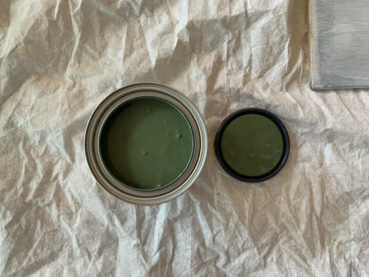
Oakmoss (SW 6180) is a deep, muted green with strong earthy undertones. This green shade can lean more gray or brown depending on the lighting, offering a neutral and timeless look that pairs well with a variety of color schemes.
Oakmoss Light Reflective Value (LRV)
The LRV for Oakmoss is 13, meaning it absorbs more light than it reflects.


What is LRV anyway? It tells us how much light a color absorbs on a scale from 0 to 100. The lower the number, the less light the color will reflect and will therefore feel darker.

The higher the LRV number, the more reflective the color, making a space feel lighter and brighter.
Where Can Oakmoss Be Used in the Home?
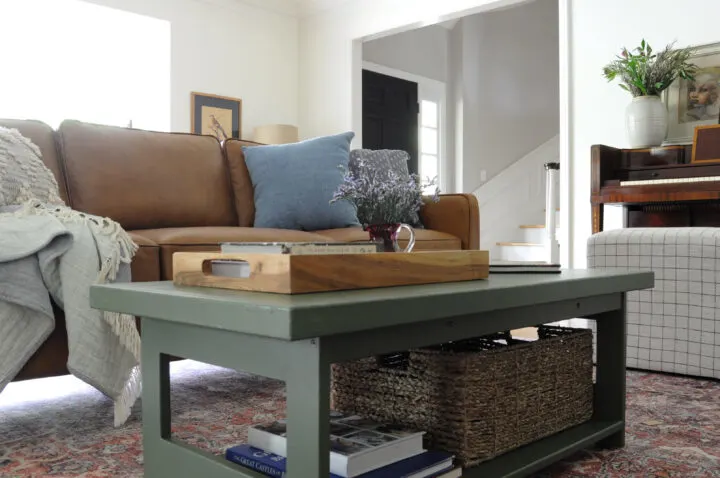
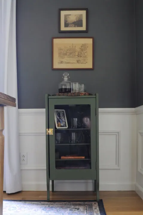
I have used this color in both our living room and dining room and it adds the perfect amount of character and warmth in each space.
Here are some ideas for using this moody green in your home:
Living Room: Create a cozy, inviting atmosphere by using Oakmoss on the walls and pairing it with warm neutrals and wooden furniture.
Bedroom: For a restful retreat, use Oakmoss as an accent wall behind the bed, complemented by soft whites and natural textures.
Dining Room: Add depth and sophistication to your dining area with Oakmoss, paired with elegant decor and warm lighting.
Home Office: Foster a calm and focused environment in your workspace by incorporating Oakmoss on the walls or as a backdrop for your desk.

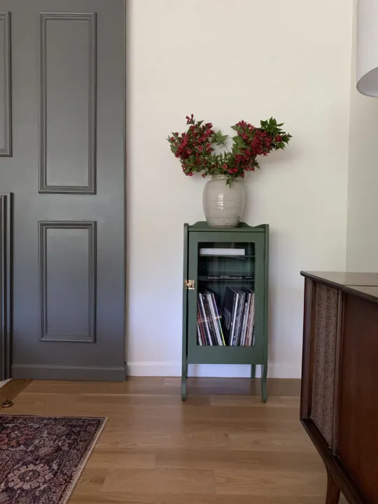
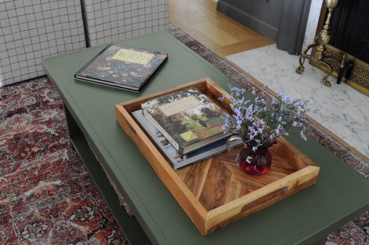
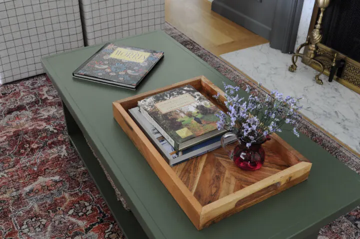
Accent Furniture: Upcycle an old piece of furniture with a fresh coat of paint. Oakmoss adds depth to furniture pieces and looks beautiful on a coffee table or cabinet.

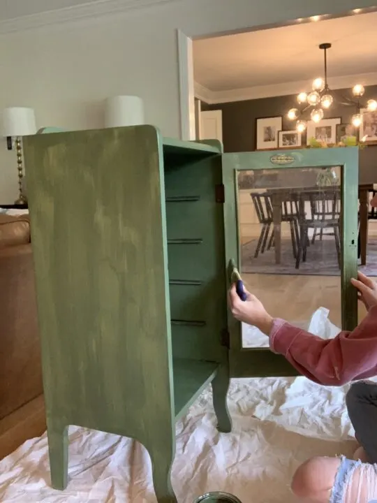
When painting furniture, I recommend using durable paint products like Sherwin-Williams Urethane Trim Enamel paint. It is more durable than standard latex paint and will hold up better to the everyday wear and tear of your household. The satin finish is a great sheen option for furniture because the painted surface can easily be cleaned.
How Does Oakmoss Compare to Other Popular Greens?
When deciding between green shades, it’s helpful to compare Oakmoss with other popular greens to find the perfect fit for your space:
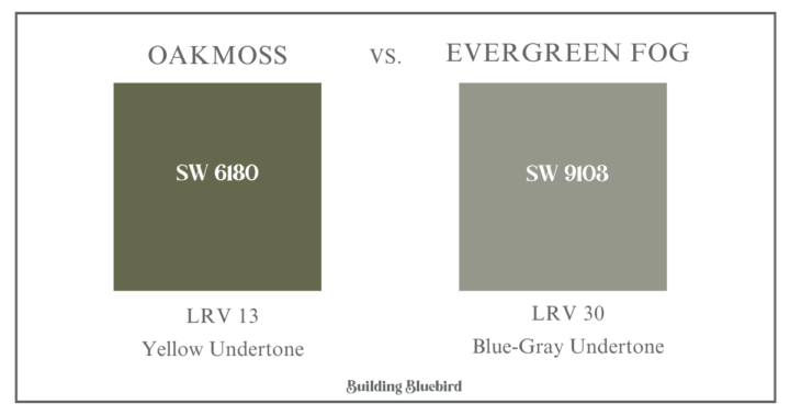
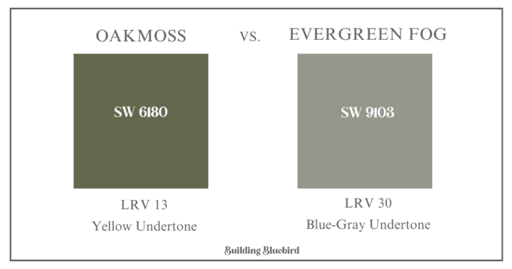
Sherwin Williams Evergreen Fog: Lighter and more subdued than Oakmoss, Evergreen Fog offers a soft, misty green that feels airy and modern. This is another one of my favorite neutral greens to use throughout our home.
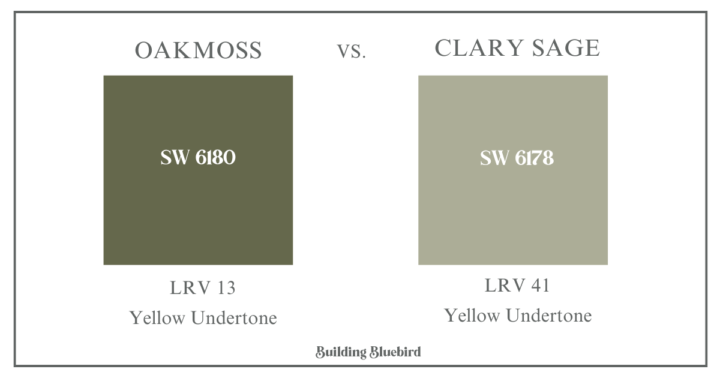

Sherwin Williams Clary Sage: A lighter, more muted green with gray undertones. Clary Sage is a good option for those who want a subtle, calming green.
*Check out more stunning sage green paint colors to try in your home!
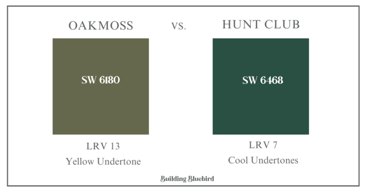

Sherwin Williams Hunt Club: A deeper, more intense green. Hunt Club has a slightly cooler tone compared to Oakmoss, making it ideal for bold, dramatic spaces.
What are the undertones of Oakmoss?
A paint undertone is a color you don’t see that can cause the main color (tone) to feel warm or cool. Warm paint colors have yellow, beige, or pink undertones. Cool paint colors have green, purple or blue undertones.
This dark green has yellow-gray undertones giving it an earthy and welcoming feel.
Is Oakmoss a warm or cool color?
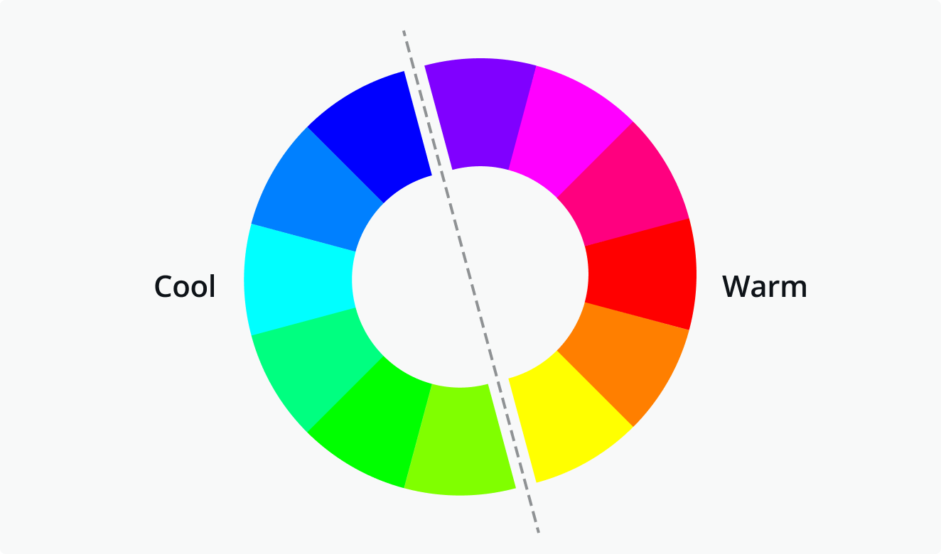
With its warm undertones, this deep green is considered a warm color. The gray undertones mute the yellow undertones creating a calming effect with this muddy green shade.
Its earthy undertones give it a cozy and inviting feel, making it an excellent choice for creating a welcoming atmosphere in any room. The warmth of Oakmoss helps it blend seamlessly with natural elements and warm neutrals.
How Does Oakmoss Look in Different Lighting?
Lighting plays a significant role in how Oakmoss appears on your walls. Here’s what to expect:

- Natural Light: In rooms with plenty of natural light, Oakmoss reveals its true depth and richness. The green becomes more pronounced, and the earthy undertones add a subtle warmth. I used this color in a room facing north, without direct sunlight. The warm green looked perfect against the Alabaster white backdrop.
- Artificial Light: Under artificial lighting, especially warm white bulbs, Oakmoss can appear on the darker side and more muted, emphasizing its earthy tones.
- Low Light: In dimly lit spaces, Oakmoss takes on a deeper, more dramatic hue, perfect for creating a cozy and intimate environment.
Before purchasing gallons of paint, I highly recommend testing samples in the actual environment or space you want to paint. Paint chips are great to get an idea of your color scheme, but the best way to ensure the paint color works in your home is with actual paint samples.
Applying paint directly to a few walls in the space will give you an accurate representation of the final color. Many paint stores also offer peel and stick paint samples to test paint colors, too.
What colors are similar to Sherwin Williams Oakmoss?
- Secret Garden (SW 6181)
- Shade Grown (SW 6188)
- Yew Hedge by Kilz
- Rosemary Sprig by Behr
- Winning Ticket by Glidden
What paint colors pair well with Oakmoss?


Oakmoss is a versatile color that pairs beautifully with a variety of other shades. Here are some combinations to consider:
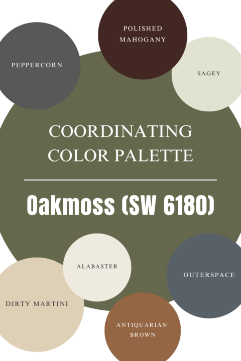
- Neutrals: Pair Oakmoss with warm neutrals like beige, taupe, and cream for a harmonious and balanced look.
- Whites: Crisp white trims and accents can make Oakmoss pop, adding a touch of elegance and sophistication.
- Other Greens: Complement Oakmoss with lighter or darker greens for a monochromatic scheme that feels cohesive and serene.
- Browns and Woods: The earthy undertones of Oakmoss pair perfectly with natural wood finishes and brown accents, creating a rustic and grounded feel.
Coordinating Sherwin Williams Paint Colors:

Tips for Using Oakmoss in Your Home


Here are some practical tips for incorporating Oakmoss into your home decor:
- Test Samples: Always test paint samples on your walls before committing. Observe how Oakmoss looks in different lighting throughout the day as well as in different locations on the wall.
- Pair with Textures: Enhance the earthy feel of Oakmoss by pairing it with natural textures like wood, linen, and jute.
- Accent Walls: If you’re hesitant to paint an entire room, start with an accent wall to add a touch of color without overwhelming the space.
- Complementary Decor: Choose decor and accessories in colors that complement Oakmoss, such as warm metals (brass, gold), natural fibers, and soft, neutral fabrics.

Oakmoss RGB Values and Hexadecimal Way
RBG: 101 / 104 / 76
Hex Value: #65684c
*In addition to this color being available at Sherwin Williams, this dark green is also available at your local Lowe’s through their HGTV Home paint line.
Oakmoss by Sherwin Williams is a rich, versatile green that can bring warmth, depth, and elegance to any room in your home. Its earthy undertones make it a perfect choice for those looking to create a cozy and inviting atmosphere.
Ready to transform your home with Oakmoss? Share your projects and experiences with us in the comments below, and don’t forget to subscribe for more home decor tips and inspiration!