
Last Updated on February 20, 2025 by lindseymahoney
Why is Alabaster the go-to favorite paint color for creamy whites?
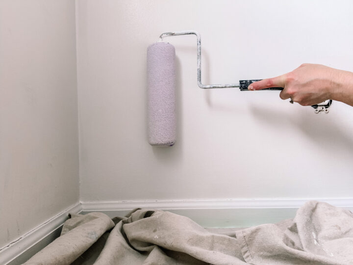
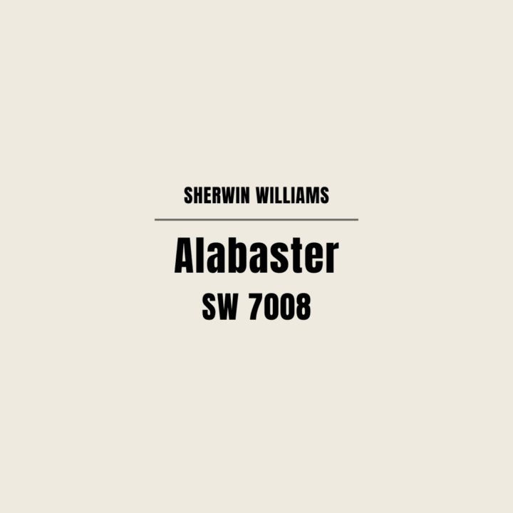
Sherwin Williams Alabaster (SW 7008) is one of my favorite neutral white paint colors. It is the perfect off-white that feels bright and fresh while also having that warm and cozy element to the paint color.
Let’s dive into a paint color review for Sherwin William’s, Alabaster!
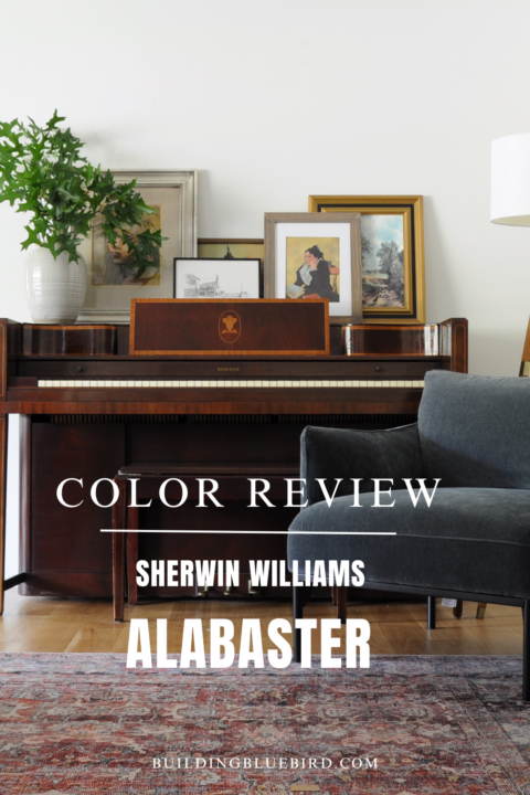

Table of Contents
- Why is Alabaster the go-to favorite paint color for creamy whites?
- What is the Light Reflective Value (LRV) for Alabaster?
- What are the Undertones of Alabaster?
- Is Alabaster a warm or cool color?
- Does Alabaster look dingy or yellow?
- What paint colors are similar to Alabaster white?
- Where Have I Used SW Alabaster in My Home?
- What paint colors pair well with Alabaster?
- SW Alabaster Coordinating Colors
- Why is Alabaster so popular?
- What Trim Color Pairs Well with Alabaster?
- What Color Cabinets Work Well with Alabaster Walls?
- Does Alabaster look good on the exterior of homes?
- Will Alabaster Work in My Home?
- Similar Content You Will Love
A hue symbolic of new beginnings, Alabaster (SW 7008), is Sherwin-Williams 2016 Color of the Year. At a time of interconnected commotion and overstimulation, Alabaster offers a sense of personal solace and revival to weary minds. It is the true neutral to set the tone for 2016.
Jackie Jordan, Sherwin-Williams director of color marketing.
What is the Light Reflective Value (LRV) for Alabaster?
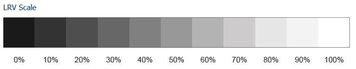

What is LRV anyway? It tells us how much light a color absorbs on a scale from 0 to 100. The lower the number, the less light the color will reflect and will therefore feel darker.
The higher the LRV number, the more reflective the color, making a space feel lighter and brighter.
The LRV for Sherwin-Williams Alabaster is 82. This means it reflects a lot of light and it is a great color option to brighten up interior spaces.
What are the Undertones of Alabaster?

A paint undertone is a color you don’t see that can cause the main color (tone) to feel warm or cool. Warm paint colors have yellow, beige, or pink undertones. Cool paint colors have green, purple or blue undertones.
Alabaster has undertones of yellow and beige/greige.
Is Alabaster a warm or cool color?
Alabaster is a warmer white paint color.

The yellow and beige undertones are more visible in spaces with direct sunlight. Because of these warm undertones, it is a great white color option for rooms with less direct sunlight.
Does Alabaster look dingy or yellow?
When some people look at Alabaster in a room, they mistake it for a beige or even gray paint color because of the undertones.
However, when you place Alabaster next to a true gray or beige paint color, it is clear that Alabaster is a bright white.
What paint colors are similar to Alabaster white?
Here are similar white paint colors that have warm undertones:
- Swiss Coffee by Benjamin Moore
- Snowfall White by Behr
- Pure White by Sherwin-Williams
- Parchment White by Glidden
- Great White by Farrow and Ball
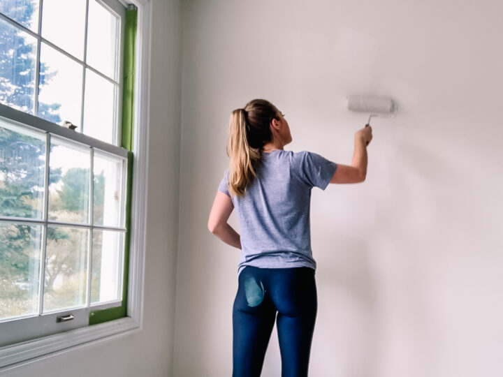
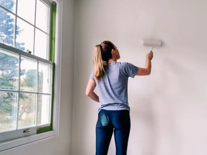
Where Have I Used SW Alabaster in My Home?
I have this creamy white on my walls throughout our home and it is such a lovely, neutral backdrop.
Living Room
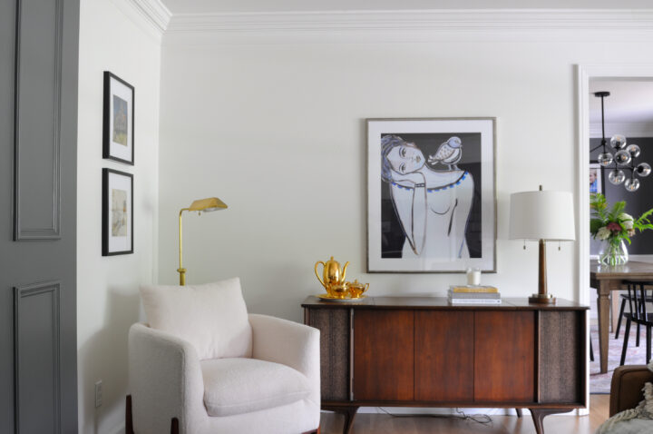
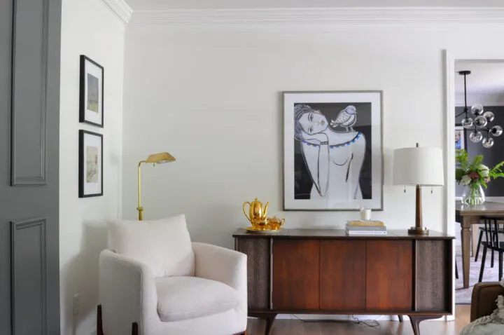
Our living room has a large bay window that lets in a lot of light, however, because it is facing north, the light is naturally more gray with a blueish cast.
This warm white is a great contrast to the cooler light shining in from the outside.
Boys Bedroom

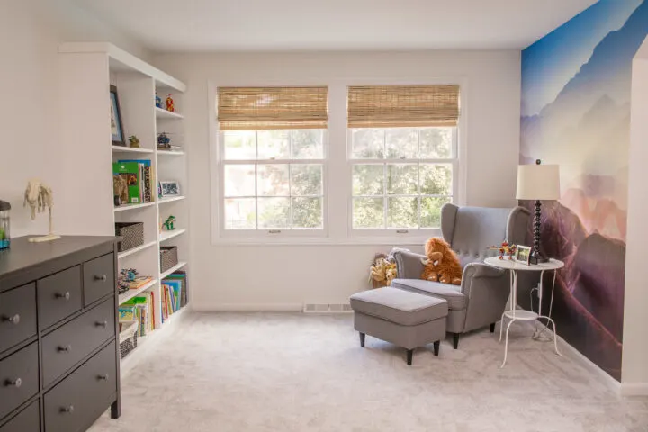
I kept the neutral white color choice consistent in my boy’s bedroom makeover and painted the walls Alabaster as well. At first, I considered choosing a cooler white since his bedroom windows face the south, but Alabaster looks perfect!
In some instances, a white paint color with warmer undertones can run the risk of looking more yellow when there is a lot of direct sunlight in the room.
Kitchen

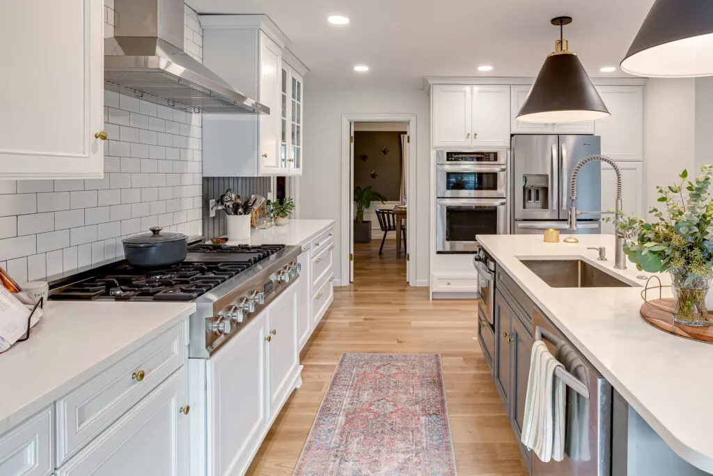
I also used the Alabaster paint color in our kitchen and family room (not shown).
What paint colors pair well with Alabaster?
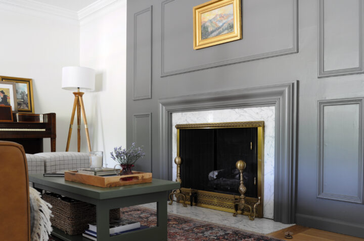
Alabaster works well with many different color palettes. I nice black color, like Urbane Bronze, pairs really well with Alabaster walls. The large black pendants look really sharp against the white, Alabaster walls.
I also love the look of a dark gray next to walls painted in alabaster.

Earth tones look really beautiful with Alabaster as well. Darker greens and browns compliment Alabaster walls and bring a space to life.

Pops of cool blue against Alabaster walls create a soothing and welcoming atmosphere.
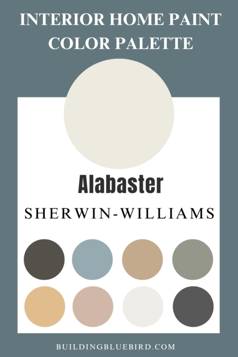
SW Alabaster Coordinating Colors
More Sherwin-Williams paint colors that coordinate with Alabaster:
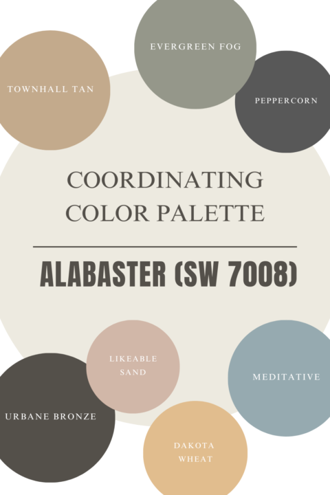

- Urbane Bronze (SW 7048) – brownish gray
- Peppercorn (SW 7674) – dark gray
- Evergreen Fog – greenish gray
- Meditative (SW 6227) – cool blue with slate gray undertone
- Gray Area (SW 7052) – an earthy, stone gray
- Townhall Tan (SW 7690)
- Dakota Wheat (SW 9023)
- Likeable Sand
Why is Alabaster so popular?
Alabaster (SW 7008) is an incredibly versatile white paint color that works in many rooms. Many people call this color “Farmhouse white” because it works so well with the casual vibe of the popular farmhouse trend these past 10 years.
What Trim Color Pairs Well with Alabaster?
In most traditional spaces, the trim around the room is white. Because Alabaster is a creamier color on the walls, a crisp white on the trim will be a nice contrast.
Sherwin Williams Extra White (SW 7006) and Pure White (SW 7005) are great options. Don’t forget to consider paint sheens as well when choosing your paint colors!
What Color Cabinets Work Well with Alabaster Walls?
Any of the paint colors that I mentioned above pairing well with Alabaster will work well as the cabinet color. The same goes for the crisp white colors I called out as good trim color options.
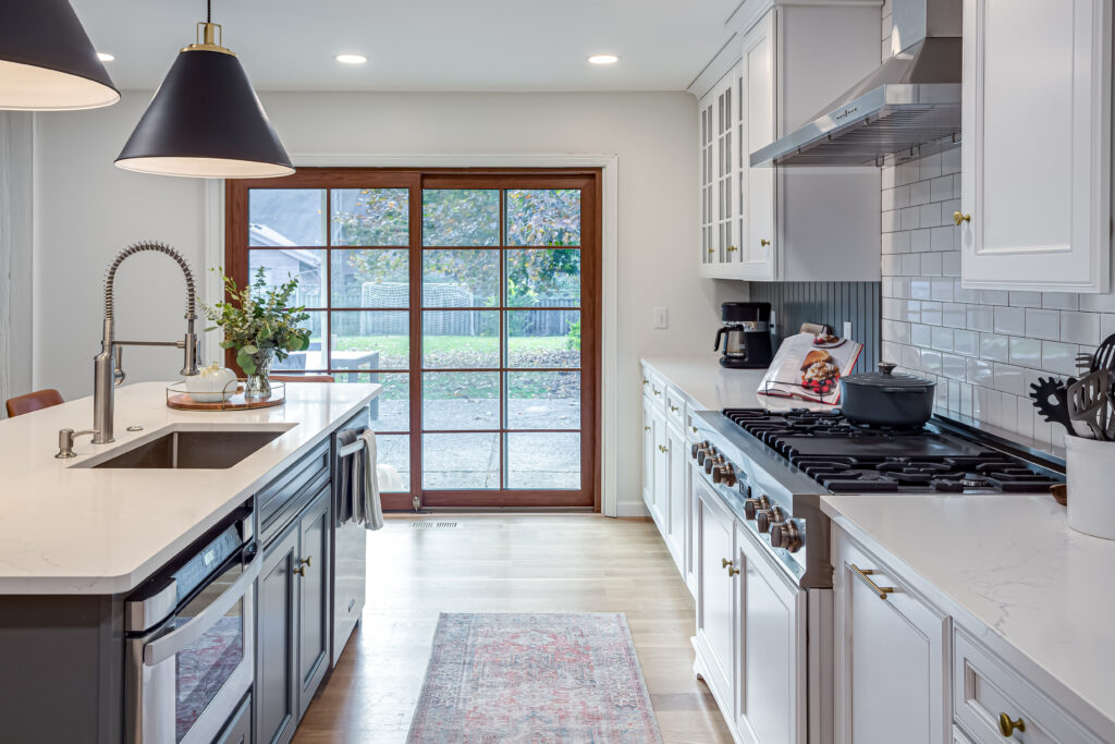
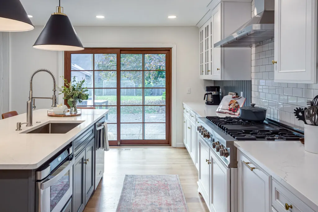
My kitchen has Alabaster walls and the wall cabinets are a crisp white while the island is dark gray.
Does Alabaster look good on the exterior of homes?
Alabaster looks fabulous on the exterior of homes and is a great backdrop for landscaping and plants.
It looks fantastic with the blueish green accents like the shutters or the front door.
Will Alabaster Work in My Home?
This question really depends on the look and feel a homeowner is trying to achieve. Here are a few questions I would consider when determining the best neutral paint color for a room in your home.
What is the mood that I want in this space?
How do you want the room to feel? I mentioned earlier in this blog post that Alabaster is often considered a “farmhouse white” paint color.
The warm and cozy color looks great in rooms that have a relaxed and comfortable mood. If the mood you want to achieve is more modern and crisp, you may prefer a more true white color with less warm undertones.
Choosing the best white paint color for a project can be really overwhelming, especially since they can all look so similar. Asking myself what mood I want in a space helps narrow down the choices.
How much natural light is in the room?
If a room gets tons of natural sunlight throughout the day, your paint color will feel warmer. If the room gets little to no natural light, your paint color will feel a little darker.
With less light in a room, you run the risk of white paint with yellow undertones looking dingy.
What direction does the room face?
There is no right answer when it comes to the direction a room is facing, but it does help determine how the paint color may look in your room.
Southern and eastern-facing rooms get more sunlight and will bring out the warmer undertones in the paint color.
North and west-facing rooms have less direct sunlight and therefore the light will be grayer and will make the wall color feel cooler.
I hope you enjoyed my paint color review of Alabaster, one of Sherwin-William’s most popular white!
Similar Content You Will Love
- 8 Ways to Update Your Vintage Tile Bathroom
- 10 Most Popular Farrow and Ball Paint Colors
- 15 Beautiful Gray Green Paint Colors
- Beautiful Blue Green Paint Colors for Walls
- Rich, Moody Paint Colors For Your Next Project
- 16 Mauve Paint Colors for Your Home

BM Swiss Coffee vs SW Alabaster: Which is Best for You?
Wednesday 11th of October 2023
[…] source […]