
Choosing the right gray paint can be tricky due to the wide range of undertones and variations. One gray that consistently stands out for its versatility and appeal is Repose Gray (SW 7015) by Sherwin Williams.

This neutral, elegant shade has become a favorite among homeowners and designers alike. In this comprehensive review, we’ll explore the characteristics of Repose Gray, answer common questions, and compare it to similar colors to help you determine if it’s the right choice for your space.
Table of Contents
- What is Repose Gray?
- Comprehensive Paint Color Review
- Using Repose Gray in Your Home
- Comparing Repose Gray to Similar Gray Colors
- Final Thoughts
- More Content You Will Love
What is Repose Gray?
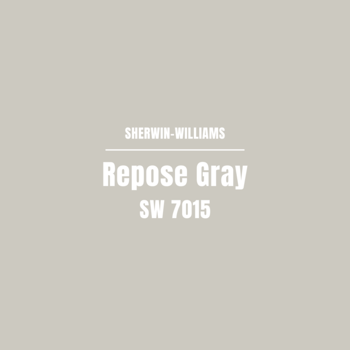
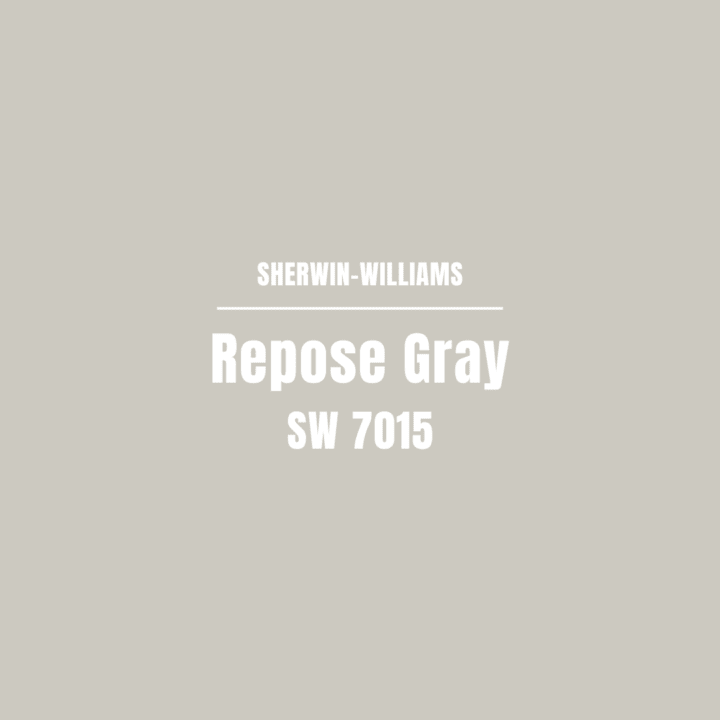
Repose Gray (SW 7015) is a light to medium gray paint color that leans slightly warm. It is known for its balanced undertones, which include a mix of gray, beige, and slight hints of blue, making it a true greige.
Color Characteristics:
- Hue: Gray
- Light Reflectance Value (LRV): 58
- Undertones: Subtle hints of beige and blue, sometimes giving off violet undertones.
- Overall Feel: Neutral, calming, and versatile paint colour
Comprehensive Paint Color Review

What colors complement Repose Gray?
Repose Gray pairs well with a variety of colors, making it a versatile choice for any space. Here are some colors that complement Repose Gray:

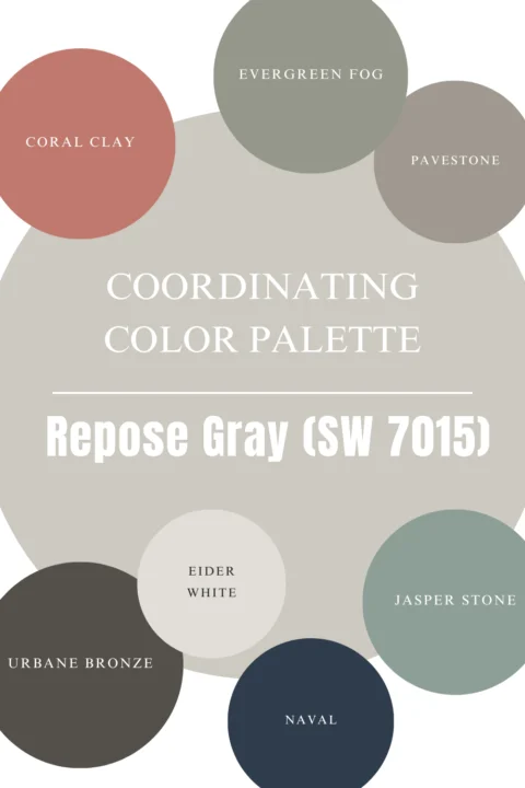
- Whites: Pure White (SW 7005) and Alabaster (SW 7008) and White Dove
- Blues: Naval (SW 6244) and Smoky Blue (SW 7604)
- Greens: Sea Salt (SW 6204) and Evergreen Fog (SW 9130)
- Other Neutrals: Accessible Beige (SW 7036) and Urbane Bronze (SW 7048)
How does Repose Gray look in different lighting conditions?
Lighting can significantly affect how Repose Gray appears:
- Natural Daylight: In natural light, Repose Gray shows its true color, a soft, balanced gray with a hint of warmth.
- Artificial Light: Warm artificial light can enhance its beige undertones, making it feel cozier. Cool artificial light can bring out its subtle blue undertones, giving it a cooler appearance.
- Low Light: In dim lighting, Repose Gray can appear slightly darker and more muted, but it maintains its neutral feel.
It is a good idea to test the paint colors within the actual space to see how it looks based on the amount of light it receives throughout the day. If you want a light and bright space but it doesn’t have a lot of natural light, Repose Gray may not be the best color option for a dark room.
Is Repose Gray suitable for exterior use?
Yes, Repose Gray is an excellent choice for exteriors. Its balanced undertones make it a versatile option that complements various architectural styles and materials. It pairs beautifully with both dark and light trim, and it can create a sophisticated look for your home’s exterior.
Using Repose Gray in Your Home
Interior Applications
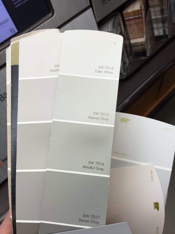

In our third home, I created a color palette for our home that included a variety of gray paint colors. To create a cohesive feel, I used different color shades from the same Sherwin-Williams paint strip.
This included Eider White (lighter color), Repose Gray, Mindful Gray, and Dorian Gray (dark gray) by Sherwin Williams.
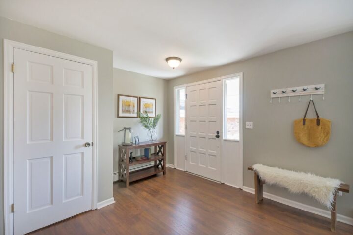
Living Rooms: Repose Gray provides a neutral backdrop that allows for flexibility in decor. It pairs well with various accent colors and styles. It is a great base color to build a design or color palette around.
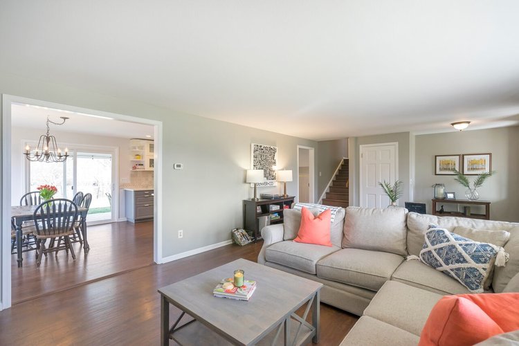

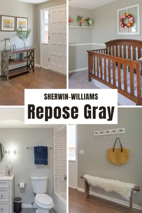
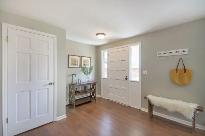
This light gray was the perfect wall color for the front entry and living room in our third home and a great color to transition into other areas of the house. Sherwin Williams Pure White is a great option for the trim color and a crisp white ceiling color with a flat sheen coordinates well with Repose Gray.
The living room transitioned into our kitchen where we had white walls and gray kitchen cabinets.
Kitchens: Repose Gray works beautifully for kitchen cabinets, walls, or as a contrast with white countertops and backsplashes.
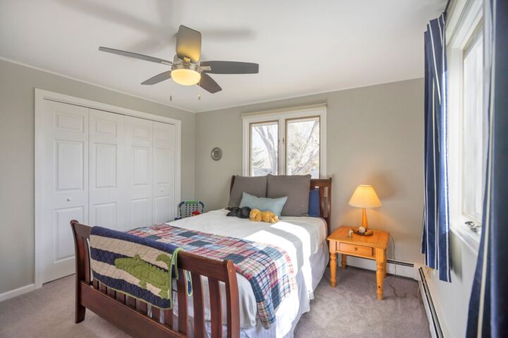
Bedrooms: Its calming, neutral quality makes it a great choice for bedrooms, creating a restful and serene environment.

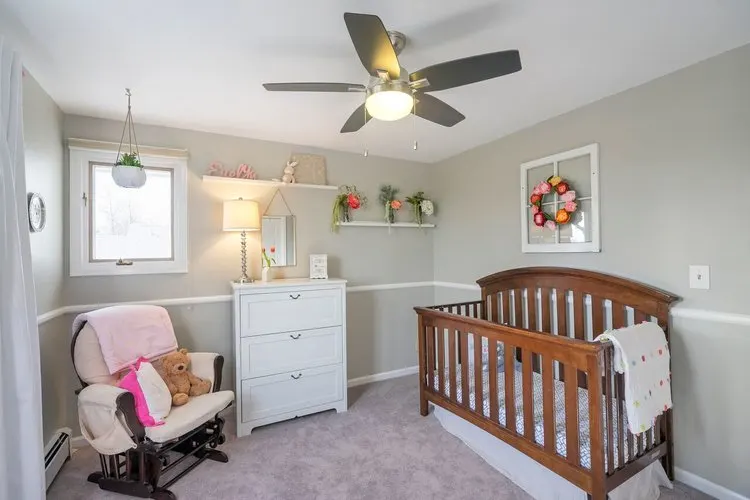
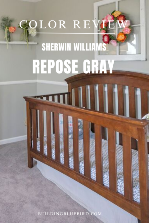
Sherwin Williams Repose Gray was the perfect paint color for our baby girls’ nursery. The gray walls were a soothing and calming backdrop for her east-facing bedroom that receives a lot of natural light.
Bathrooms: It adds a touch of elegance and tranquility to bathrooms, especially when paired with white or marble finishes.

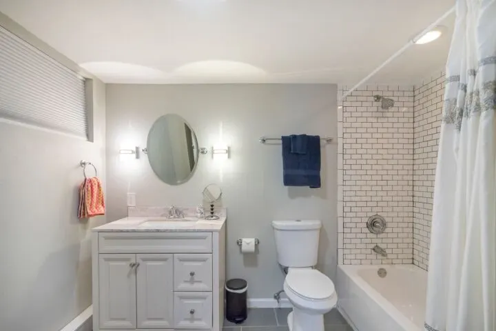
We also used Repose Gray in the guest bathroom in the basement. The neutral gray pairs well with white paint colors and was a good choice to create a relaxing space for guests.
Exterior Applications
- Siding: Repose Gray offers a timeless, sophisticated look for exterior siding, complementing various architectural styles.
- Trim and Accents: Use Repose Gray for trim, shutters, or doors to create a cohesive and elegant exterior palette.
- Contrasting Colors: Pair Repose Gray with darker roof shingles or bold accent colors for a striking contrast.
Comparing Repose Gray to Similar Gray Colors
Repose Gray vs. Agreeable Gray (SW 7029)
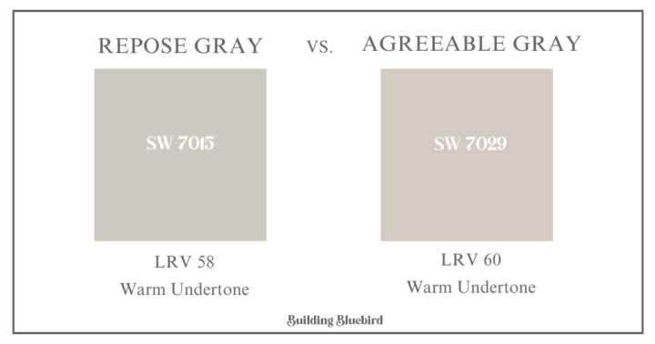
Sherwin Williams Agreeable Gray is another popular greige paint color and the best-selling paint color at Sherwin-Williams:
- Light Reflectance Value (LRV): SW Agreeable Gray has an LRV of 60, slightly higher than Repose Gray’s LRV of 58.
- Undertones: Agreeable Gray leans more towards beige with subtle green undertones, making it a warmer color than Repose Gray.
- Usage: Both colors are versatile, but Agreeable Gray might be preferred for spaces where a warmer, more beige tone is desired.
Repose Gray vs. Mindful Gray (SW 7016)
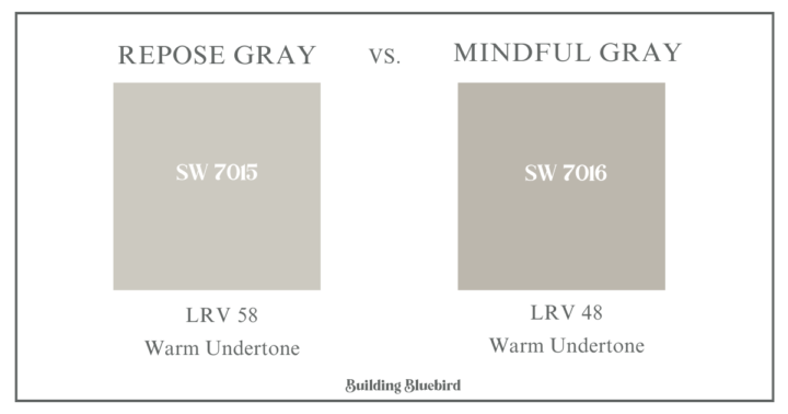
Mindful Gray is another close competitor:
- Light Reflectance Value (LRV): Mindful Gray has an LRV of 48, making it darker than Repose Gray.
- Undertones: Mindful Gray has stronger gray and taupe undertones, making it slightly cooler than Repose Gray.
- Usage: Mindful Gray is a great option for creating a deeper, more dramatic look, while Repose Gray is lighter and more adaptable.
Repose Gray vs. Revere Pewter by Benjamin Moore
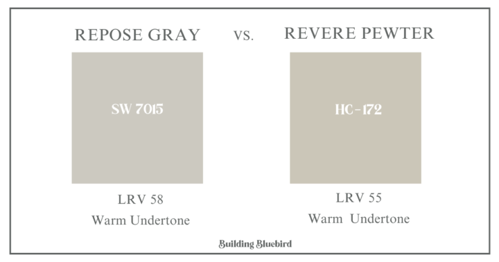
Revere Pewter (HC-172) is another popular color that I like to use as a neutral backdrop in our home.
- Light Reflectance Value (LRV): Revere Pewter has an LRV of 55, making it slightly darker than Repose Gray.
- Undertones: Revere Pewter is a chameleon neutral that provides a versatile bridge between warm and cool tones.
- Usage: Revere Pewter is a great alternative to Repose Gray if you want slightly more tan undertones in your space.
Is Repose Gray a warm or cool color?
Repose Gray is generally considered a warm gray paint color due to its beige undertones.

However, its subtle blue undertones can sometimes give it a cool appearance in certain lighting conditions, making it a very balanced and adaptable color.
Repose Gray Hexadecimal Code and RBG Values:
Hex Code: #cbc6b8
RBG: 204 / 201 / 192
Final Thoughts
Repose Gray by Sherwin Williams is a versatile, balanced gray that can enhance various spaces in your home. Its subtle undertones and neutral quality make it a great choice for both interiors and exteriors.
Whether you’re looking to create a calm, serene bedroom or a sophisticated living room, Repose Gray offers a timeless appeal that complements a wide range of design styles.
Remember to always test paint samples in your specific environment to see how the color interacts with your lighting and other elements. Happy painting!