Last Updated on March 4, 2025 by lindseymahoney
Let’s do a color review of Sherwin-Williams 2023 color of the year – Redend Point (SW 9081)!
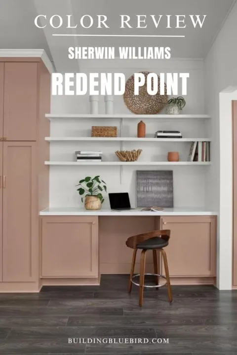
Table of Contents
- Frequently Asked Questions
- What paint colors go well with Redend Point?
- Where can I use Redend Point in my home?
- What paint colors are similar to Sherwin Williams Redend Point?
- What is the Light Reflective Value (LRV)?
- Is the Redend Point a warm or cool paint color?
- What are the undertones in Redend Point?
- More Paint Color Inspiration You Will Love
Every year, the biggest paint brands choose a color of the year that they predict will be a popular hue that will dominate design in the new year.
*Check out the color review for the 2024 Sherwin-Williams COTY – Upward!
This muted hue is the perfect neutral paint color to try in your home. When applied to the walls of a room, this beautiful earth tone creates a cozy and inviting atmosphere.
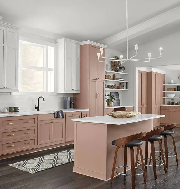
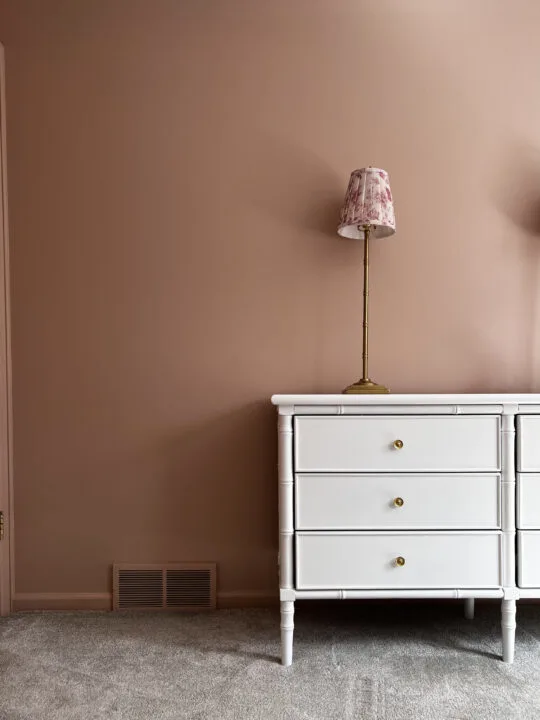
This mauve pink is a chameleon color that can change from brown to pink depending on the time of day. Jenni from ISPYDIY used this warm color as the backdrop for her daughter’s reading nook.
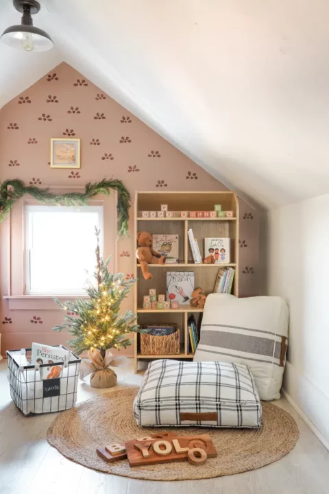
Redend Point works well in all styles of homes ranging from contemporary to historical.
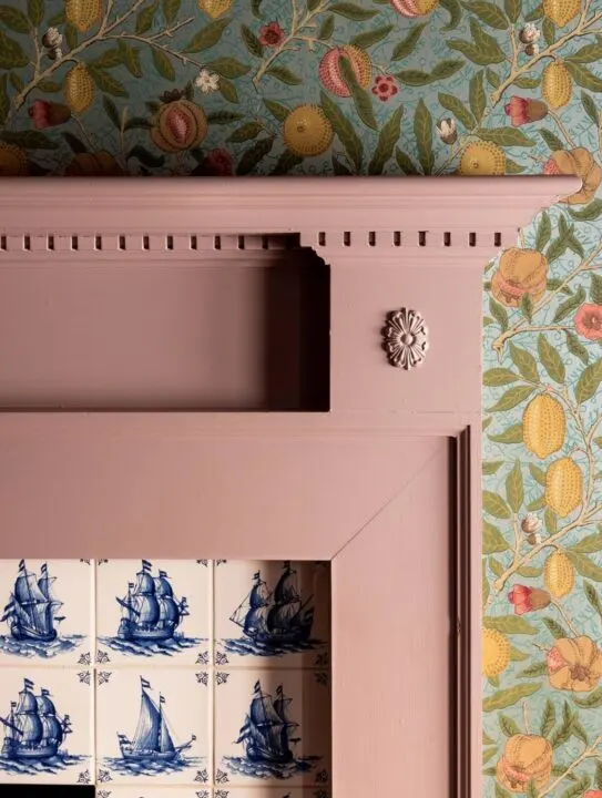
Heidi Caillier pairs this warm color with classic William Morris wallpaper and vintage Delft tiles on the fireplace. It looks perfect in the sitting room of this historic home.
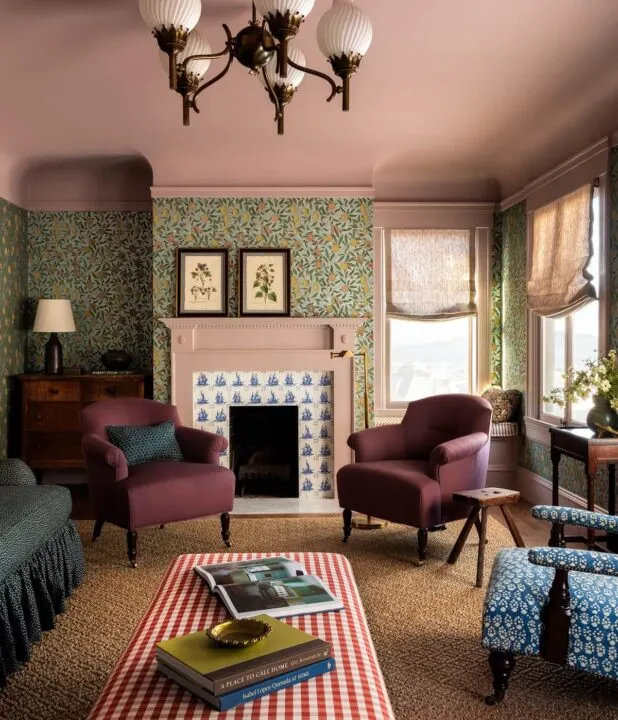
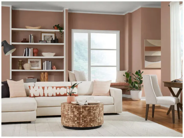
Here is an example of Redend Point in the living room of a more modern and contemporary home.
The room is filled with muted neutrals and earth tones that compliment the warm blush paint color on the walls.
Frequently Asked Questions

What paint colors go well with Redend Point?
Trim Color
If you are looking for a trim color to use with Redend Point, a crisp white paint color is a great option. The white paint color brings out the pink undertones of this warm color.
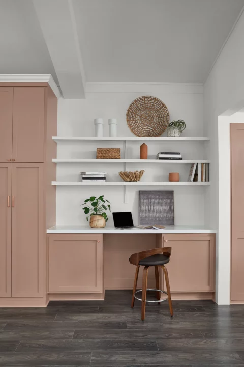
Another fresh look is painting the trim the same color as the walls.
I like painting the trim, doors, and walls the same color in smaller rooms. For contrast, try using a different paint sheen on the trim.
Complimentary Earth Tones
Complimentary earth tones also pair well with Redend Point as well. Sherwin-Williams recommended the colors below:
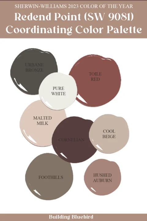
Contrasting Cooler Colors
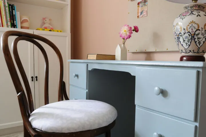
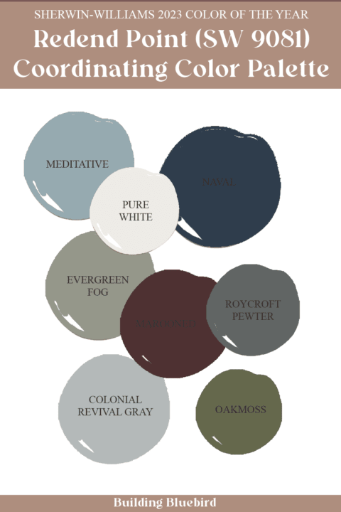
Redend Point also looks nice with contrasting cooler colors like the light blue desk below.
Here is a list of cooler, coordinating colors by Sherwin-Williams that pair well with Redend Point:
Where can I use Redend Point in my home?
Rooms in Your Home
This versatile color can be used in any room in your home from bedroom walls to kitchen cabinets.
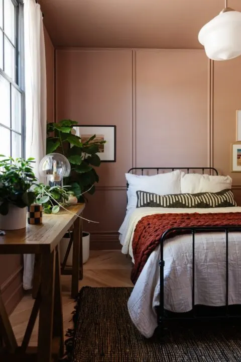
Mandi from Vintage Revivals painted this cozy color on the walls, trim, and ceiling in a bedroom of her home.
The picture frame molding adds architectural interest and texture to the single color throughout the room.
Textiles & Home Goods
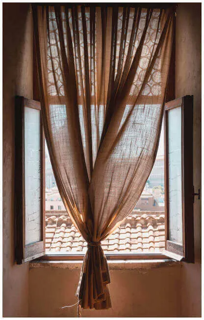
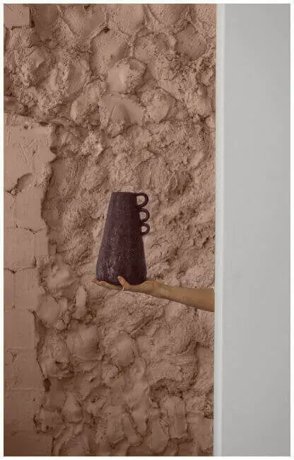
You can also add this warm neutral to your home through textiles and decorative items in each space.
What paint colors are similar to Sherwin Williams Redend Point?
If you are looking for a paint color dupe by a different brand, check out the similar colors below.
- Kilz – Dusty Bronze
- Valspar – Irish Tea
- Sherwin Williams – Likeable Sand
- Farrow and Ball – Setting Plaster
*For a more complete list of pinky-beige paint colors to try in your home, check out my mauve paint color roundup.
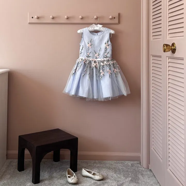
I chose a muted pink paint color for my daughter’s bedroom that is actually in the same color family as Redend Point. If you are interested in a lighter version of this warm color, Likeable Sand is a great option.
What is the Light Reflective Value (LRV)?
The LRV for Redend Point (SW 9081) is 30.

LRV tells us how much light a color absorbs on a scale from 0 to 100. The lower the number, the less light the color will reflect and will therefore feel darker. The higher the LRV number, the more reflective the color, making a space feel lighter and brighter.
Is the Redend Point a warm or cool paint color?
Redend Point is considered a warm paint color because it falls within the orange/red color family.
What are the undertones in Redend Point?
The Redend Point paint color has pinkish undertones.
A paint undertone is the color you don’t see that can cause the main color (tone) to feel warm or cool. Warm paint colors have yellow, beige, or pink undertones. Cool paint colors have green, purple or blue undertones.
I hope this color review of Redend Point inspires you to try this warm color somewhere in your home.
Whether it is in a room that needs to be painted or the color of a throw blanket in a space, this color can be incorporated into your design in many beautiful ways.
While I love seeing the chosen paint colors for each new year, I do not think one should have to repaint their house whenever trending colors arise.
When designing the rooms in our home, my goal is to choose colors that will last many years and incorporate classic and timeless decor/furniture.
Thanks for stopping by!
More Paint Color Inspiration You Will Love
- 15 Beautiful Gray Green Paint Colors
- Evergreen Fog by Sherwin Williams | Color Review
- Rich, Moody Paint Colors For Your Next Project
- Beautiful Blue Green Paint Colors for Walls
- The Best Cottagecore Paint Colors
- Sherwin Williams Alabaster Color Review
- 2024 Color of the Year Round-up From Popular Paint Brands
- 2021 Paint Color Trends | What to Expect This Year
- 2022 Color Trends to Expect in the New Year
