Last Updated on June 20, 2023 by lindseymahoney
I have always loved the cottagecore style, but back when I was in college, it was called Shabby Chic! While the shabby chic trend in the 2000s had more of a romantic feel with creamier colors and light pinks, cottagecore paint colors are with warmer, natural earth tones.
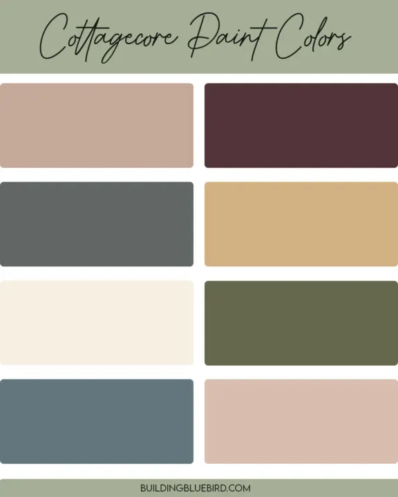
Table of Contents
- What is cottagecore?
- The Best Cottagecore Paint Colors
- Oakmoss by Sherwin Williams
- Svelte Sage by Sherwin Williams
- Skylight by Farrow and Ball
- Likeable Sand by Sherwin Williams
- Highland Peat by Fenwick & Tillbrook
- Dead Salmon by Farrow & Ball
- Setting Plaster by Farrow & Ball
- Meet Cute by Clare Paint
- Restrained Gold by Sherwin Williams
- Chestertown Buff by Benjamin Moore
- Money Moves by Clare Paint
- Burnham Overy by Fenwick & Tillbrook
- Down Pipe by Farrow & Ball
- Oyster by Fenwick & Tillbrook
- Brinjal by Farrow & Ball
- How to Use Cottagecore Paint Colors in Your Home
- Similar Content You Will Love
What is cottagecore?
Cottagecore is an aesthetic that became popular on social media and idealizes living in the English countryside. It focuses on natural elements, colors, and florals.
This design style creates a feeling of peace and coziness that welcomes you to relax within the room. Cottagecore is also called grandmillenial style.
The Best Cottagecore Paint Colors
This post includes affiliate links, thanks for supporting Building Bluebird!
The cottagecore aesthetic falls within the same vein as the shabby chic design style of the early 2000s.
My college bedroom (2005) definitely had the romantic cottage vibe with a floral quilt by the brand Shabby Chic from Target, a DIY green and white chippy bed frame, a wicker dresser, and a vintage birdcage.
Our first home had the cottagecore style as well with yellow walls, a blue-striped couch, and white-painted furniture. Looking for the perfect cottagecore color palette for your home?
Check out the paint colors below!
Oakmoss by Sherwin Williams
Earthy neutrals ground the cottagecore aesthetic, providing a natural backdrop that enhances the cozy, lived-in feel.
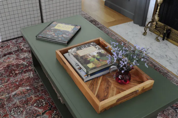
I recently updated our living room with a cozy, MCM design and incorporated this dark green color into the design. This dark color paired with earthy terracotta hues in the rug and the creamy white walls, creates a modern cottagecore look.
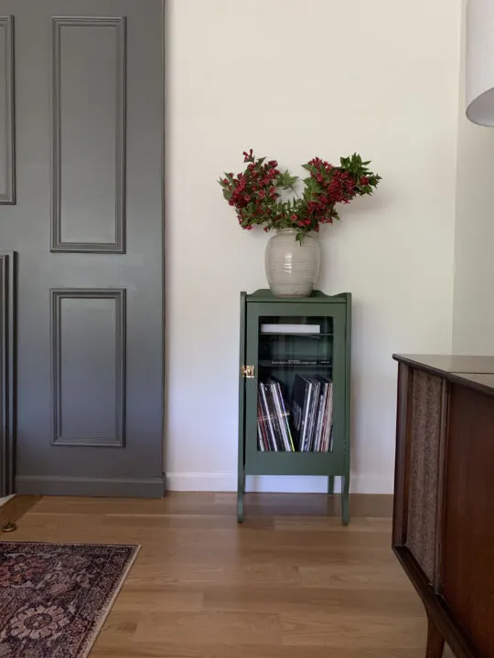
I found this old cabinet at a garage sale and decided to paint it a warm green to offset all of the red hues in the room. Oakmoss by Sherwin Williams was the exact color I imagined in my mind and I am so happy with how it turned out.
The green color gives the cabinet character without distracting from the other decor around the room.
Svelte Sage by Sherwin Williams
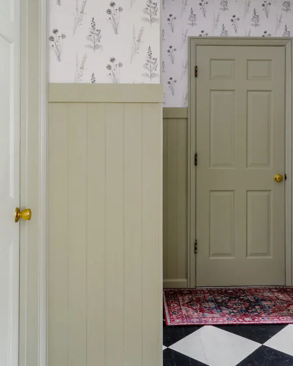
Colors inspired by nature, like sage greens, are at the heart of cottagecore. These soft green shades bring the outdoors inside, fostering a connection to the natural world.
Our mudroom makeover is one of my favorite transformations in our house. We installed vertical wall planks for visual interest and I installed a flora and fauna wallpaper for added character.
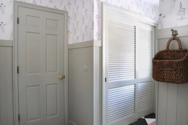
Because you can see straight into the mudroom from our kitchen, I made sure to choose a green that would not clash with the design and colors in our kitchen. Svelte Sage was the perfect green that blended seamlessly with the dark gray planking in our kitchen.
Skylight by Farrow and Ball
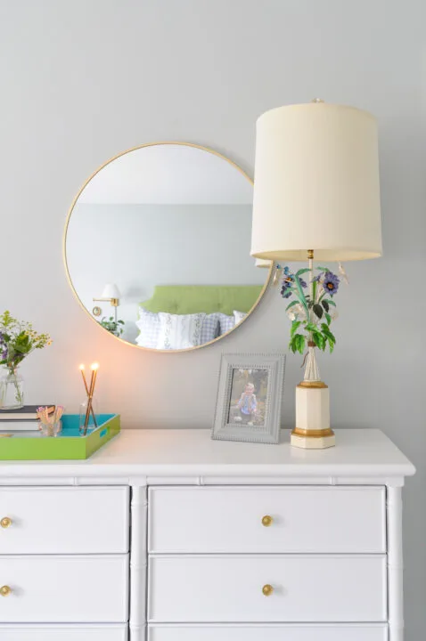
Light blue shades capture the serenity of clear skies and open spaces.
Use sky blue in bedrooms and bathrooms for a peaceful retreat. Pair this pastel paint wall color with floral prints to achieve that cottagecore feel. I applied this pastel blue to our guest bedroom and it is my favorite serene retreat!
Likeable Sand by Sherwin Williams
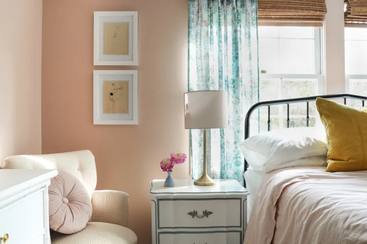
Soft pastel colors are quintessential to the cottagecore palette. They evoke a sense of tranquility and bring a gentle, whimsical feel to any room. Think of delicate roses and vintage linens.
Blush pink adds a romantic touch and pairs well with whites and florals. I used Likeable Sand in my daughters bedroom and it is one of my favorite earthy tones that I have used in our own home! It is the perfect backdrop to achieve the vintage look in her bedroom.
Highland Peat by Fenwick & Tillbrook
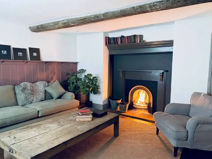
One of my favorite Instagram accounts to follow right now is My Tiny Estate. Borja and Dean are restoring an old English estate and it is so fun to follow along!
The Caretakers cottage has a muted reddish/brown paint color on the wall called Highland Peat. Fenwick and Tillbrook say it is reminiscent of the Scottish wilderness.
What better place to find inspiration for cottagecore paint colors than old English estates?!
Dead Salmon by Farrow & Ball
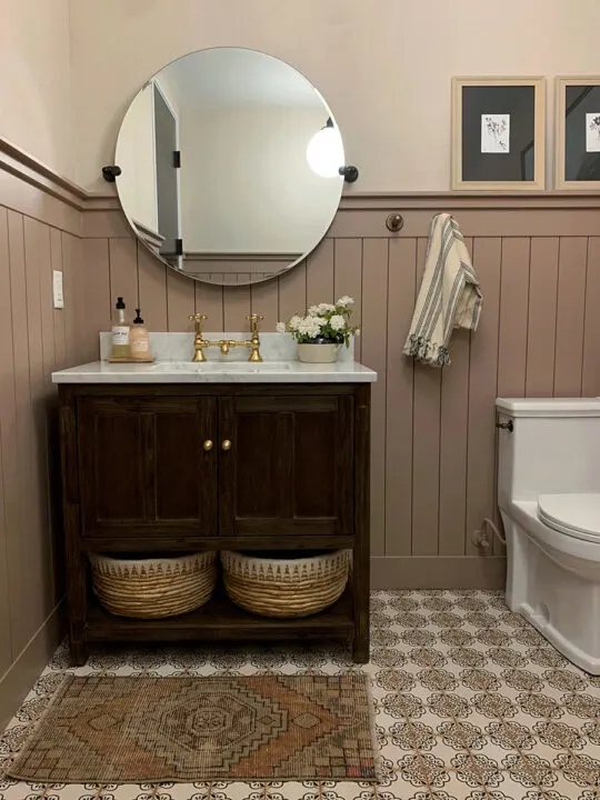
The name, Dead Salmon, refers to the matt finish of an aged pink painted at Kedleston Hall in 1805 and is one of my favorite cottagecore colors. I have shared this paint color before in my dark and moody paint colors post, but I just can’t quit it!
I have a thing for these ambiguous taupe paint colors that go from pink to brown depending on the time of day.
Setting Plaster by Farrow & Ball
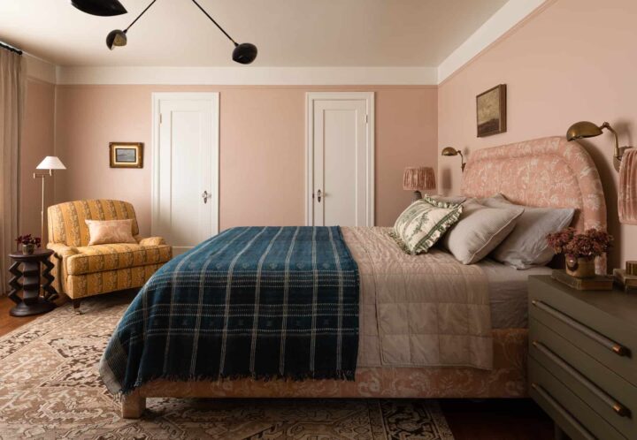
Setting Plaster is a a dusty pink that feels historic with a softness due to the warm yellow undertones. Heidi Caillier has been my design crush for some time now and I cannot get enough of this beautiful bedroom!
The dusty pink is called Setting Plaster and it is the perfect neutral for the warm tones and patterns in this bedroom.
Meet Cute by Clare Paint
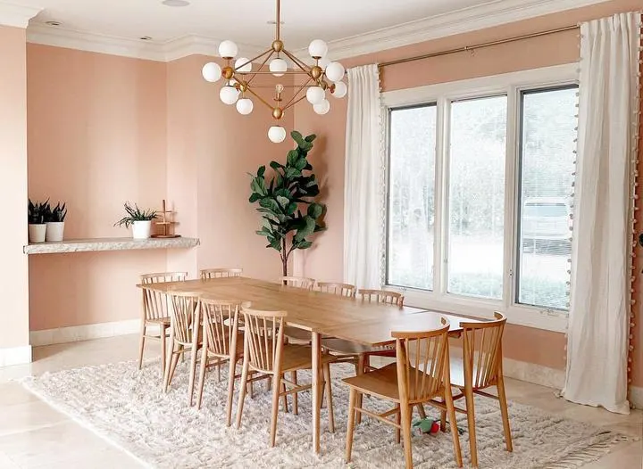
Along with Clare Paint offering a more eco-friendly paint option, they also get the award for best paint color names! Meet Cute is another dusty pink that can be used as a neutral in your home.
Restrained Gold by Sherwin Williams

Chris Loves Julia gave us a front-row seat to use every color of the rainbow in muted tones at their last house. Finding the perfect yellow paint color has always been challenging for me.
I have made my fair share of design mistakes when choosing yellow paint colors because I was not paying attention to undertones in the color. This mistake led me to what I like to call “Waffle House walls” and “baby duck walls”.
I have avoided yellows for a while now, but after seeing inspiring designs like Chris Loves Julia’s playroom, I think I am ready to try it again!
Chestertown Buff by Benjamin Moore
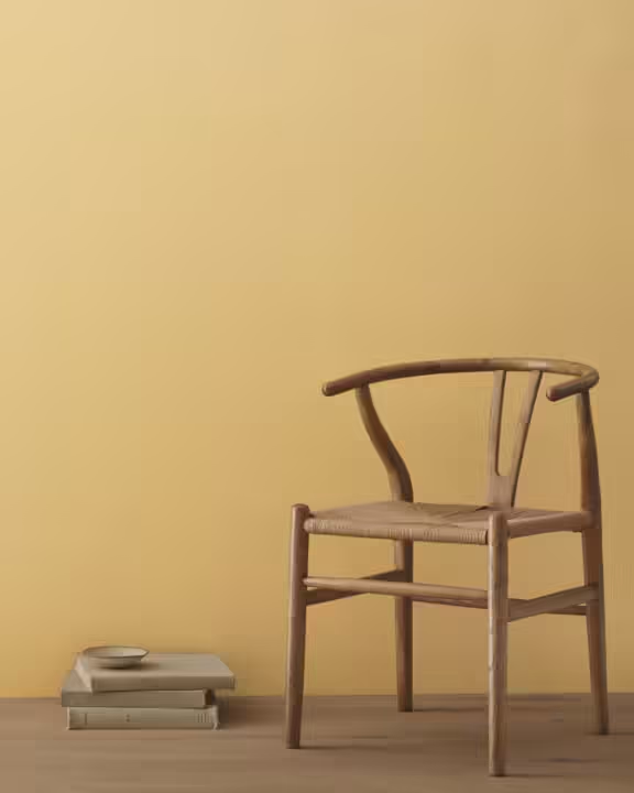
When you think of an English cottage, doesn’t a warm yellow come to mind? Chestertown Buff against the white beadboard is the perfect cottagecore paint color to try at home.
Money Moves by Clare Paint
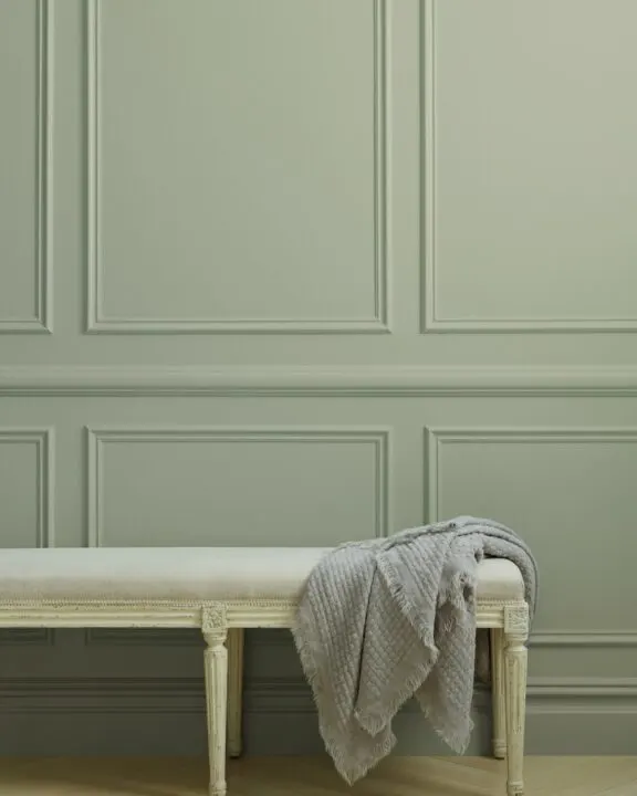
Money Moves is another great sage green paint color option by Clare Paint.
Choosing muted colors like this is the perfect substitute for the standard gray walls. Sage walls will give you added interest and the cottage-core vibe you are looking for.
Burnham Overy by Fenwick & Tillbrook
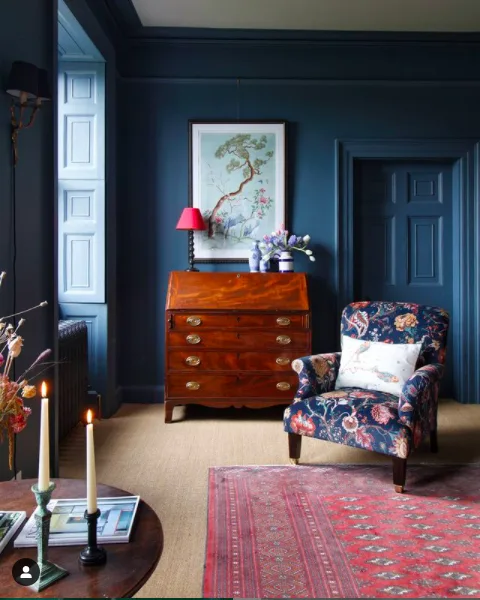
Another one of my favorite Instagram accounts to follow is Greg from Man With a Hammer! He is restoring a Georgian home that has fallen into disrepair and I love all of his design choices.
This dark blue gray bedroom looks so warm and inviting with Burnham Overy on the walls and bold patterns.
Down Pipe by Farrow & Ball
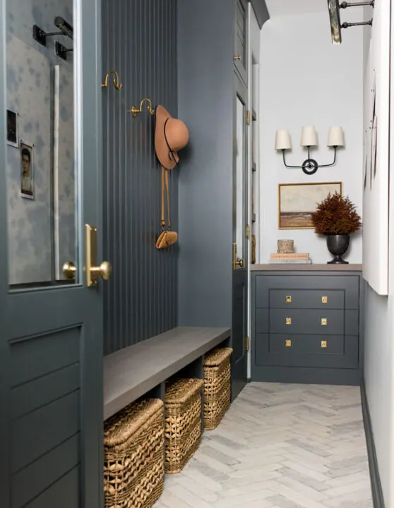
Down Pipe is a dramatic lead gray with blue undertones. I love a good gray/black neutral and Down Pipe by Farrow and Ball is a beautiful option!
Oyster by Fenwick & Tillbrook
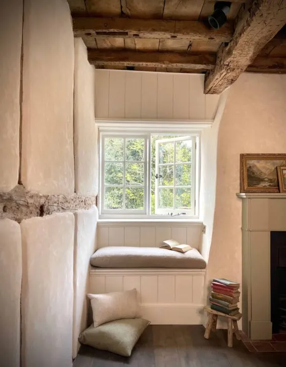
More inspiration from the English estate over on the My Tiny Estate Instagram account! Borja and Dean have used Oyster by Fenwick and Tillbrook in multiple rooms in their cottage. Oyster is a warm, peachy white inspired by the warm white found inside an oyster shell.
It has warm undertones and looks beautiful with the old exposed ceiling rafters and historic details in each room.
Brinjal by Farrow & Ball
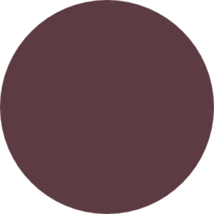
Brinjal is described as a sophisticated aubergine. I have found so many inspirational images with this deep purple paint color, it is so rich and always makes me do a doubletake! This study at Ben Petreaths Georgian estate (via House Beautiful) is stunning.
I am sure I will be adding more cottagecore paint colors that I want to try soon, but for now, I think this is a pretty great list!
Which color is your favorite?
How to Use Cottagecore Paint Colors in Your Home
1. Create Cozy Nooks
Transform a corner of your living room or bedroom into a cozy reading nook. Paint the walls in a soft pastel or earthy neutral and add a comfortable armchair, layered with cozy blankets and cushions. A small bookshelf and a vintage lamp complete the look.
2. Design a Charming Kitchen
Incorporate nature-inspired hues like sage green or mint green into your kitchen. Paint your cabinets or a feature wall to create a focal point. Pair these colors with wooden accents and vintage-style hardware to enhance the cottagecore vibe.
3. Transform Your Bedroom
Create a serene and romantic bedroom by using blush pink or lavender on the walls. Complement these colors with floral bedding, lace curtains, and antique furniture. Add soft lighting with fairy lights or a delicate chandelier to complete the look.
4. Brighten Up the Bathroom
Use sky blue or soft gray in your bathroom to create a calming oasis. These colors work well with white fixtures and natural materials like wood and stone. Add vintage touches with brass faucets, a clawfoot tub, and framed botanical prints.
5. Embrace Vintage Decor
Cottagecore celebrates vintage and antique items. Paint old furniture pieces in warm beige or cream to give them new life. Look for second-hand treasures like wooden chests, side tables, and chairs that you can transform with a fresh coat of paint.
6. Bring the Outdoors In
Use nature-inspired hues throughout your home to create a seamless connection between the indoors and outdoors. Paint your entryway or hallway in terracotta or sage green, and decorate with potted plants, wicker baskets, and natural textiles to enhance the organic feel.
7. Layer Textures and Patterns
Cottagecore is all about layering textures and patterns to create a cozy, eclectic look. Use your chosen paint colors as a backdrop and add patterned wallpapers, floral fabrics, and textured rugs to bring depth and interest to your space.
Similar Content You Will Love
- 15 Beautiful Gray Green Paint Colors
- Color Review | Sherwin Williams Redend Point
- Popular Farrow & Ball Colors Matched to Behr
- The Best Blue Green Paint Colors to Try at Home
- Color Review | Sherwin Williams Oyster Bay
- The Best Supplies for Painting Interior Spaces
- I Applied Latex Over Oil Based Paint | How To Fix
- Sherwin Williams Eider White | Color Review
