Last Updated on February 25, 2025 by lindseymahoney
I am digging the rich, moody paint colors trend and am craving this design aesthetic even more as we head into Fall! If you’re looking to make a bold statement with your interior decor, here are some of the best moody paint colors to try at home.
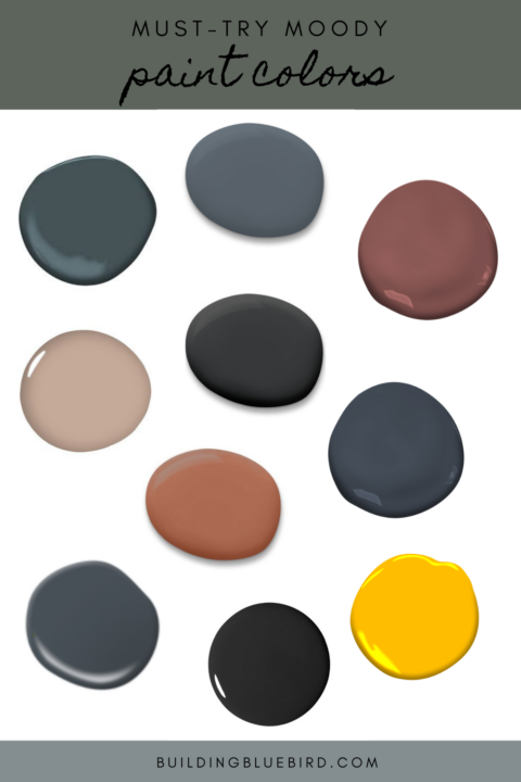
*Looking for more paint color suggestions? Check out my favorite neutral interior colors for a room and the list of 2020 trends!
Table of Contents
- What are Moody Paint Colors?
- The Best Moody Paint Colors for Your Walls
- Peppercorn by Sherwin Williams
- Outerspace by Sherwin Williams
- Fading Twilight by Benjamin Moore
- Dead Salmon by Farrow & Ball
- Inchyra Blue by Farrow & Ball
- Brinjal by Farrow & Ball
- Chimney by Behr
- Yellow Flash by Benjamin Moore
- Hale Navy by Benjamin Moore
- Greenblack by Sherwin Williams
- Cavern Clay by Sherwin Williams
- Narragansett Green by Benjamin Moore
- Caviar by Sherwin Williams
- Tips for Using Moody Paint Colors
- Similar Content You Will Love
- Commonly Asked Questions
What are Moody Paint Colors?
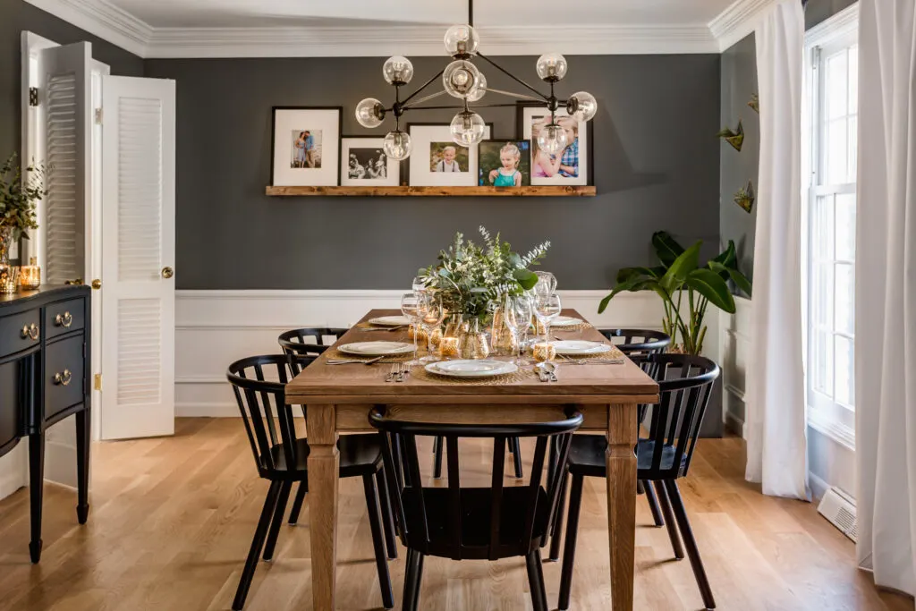
Moody paint colors are characterized by their depth and intensity. They often fall into the categories of dark neutrals, rich jewel tones, and deep earth tones. These colors can evoke a range of emotions, from serenity and comfort to drama and luxury.
Moody paint colors aren’t just your standard dark blues and warm greens. In my opinion, any color can become “moody” when it is desaturated and has more gray undertones.
The descriptors “muddy”, “muted” or “earthy” are often used when describing these moody colors because they look like colors that can be found in nature.
These colors tend to have an LRV lower than 50 and easily create a cozy atmosphere in a space.
The Best Moody Paint Colors for Your Walls
Peppercorn by Sherwin Williams
LRV 10

Mary from Merrily Modern painted one wall in her foyer using Peppercorn SW 7674 and it looks absolutely perfect with the blue tile and blue door. A foyer like this makes quite the first impression with guests!
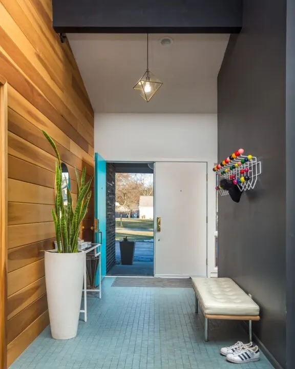
The charcoal gray color is a popular choice for creating a modern atmosphere in any space. This versatile paint color pairs well with a variety of decor styles, from contemporary to traditional.
Its deep and rich tone adds depth and sophistication to any room. Whether you use it on the walls, furniture, or as an accent color, charcoal gray creates a sleek and elegant look.
It pairs beautifully with metallic accents, bold pops of color, and clean lines.
Outerspace by Sherwin Williams
LRV 12

I used Outerspace SW 6251 for our master bedroom makeover and it completely changed the feel of the room! This rich, dark blue paint color is a bold yet cozy backdrop without feeling too dark.
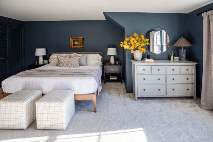
I applied the same dark color to the trim and doors for a modern and fresh look.
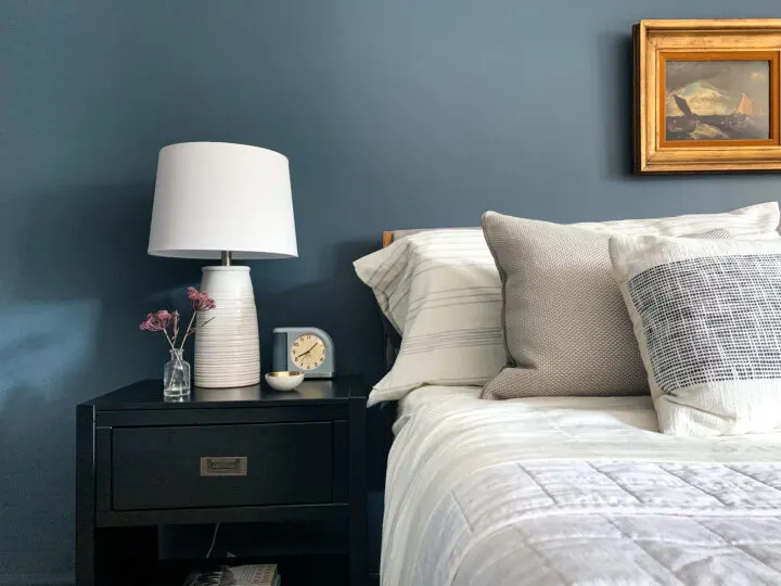
The bedroom below is designed by Clark + Aldine and is out of this world! Ok, sorry, that was really cheesy but I couldn’t help myself!
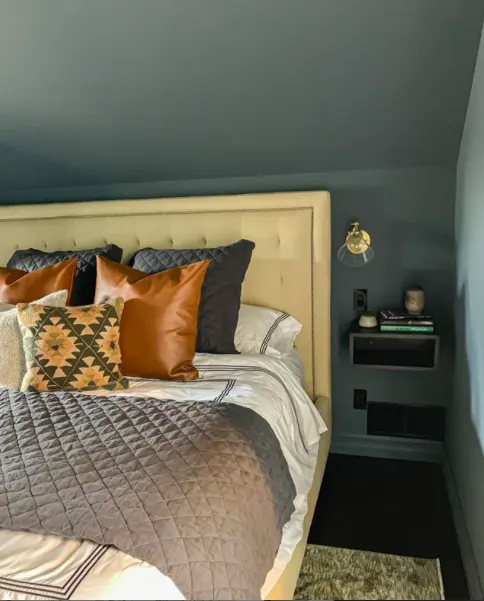
Danielle used this blue-green paint color to create a cozy bedroom with masculine vibes for one of her clients. Moody blues like Outerspace are a great option for bedrooms.
*Hague Blue by Farrow and Ball is another deep dark blue that works great indoors as well as exterior of homes.
Fading Twilight by Benjamin Moore
LRV 14

Julia from ChrislovesJulia always gets paint colors right! Fading Twilight by Benjamin Moore is the perfect jewel-toned burgundy for their music room.
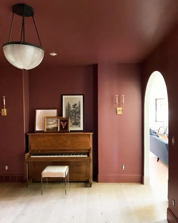
The painted ceiling and baseboards make a dramatic statement to this moody music room.
Dead Salmon by Farrow & Ball
LRV 42
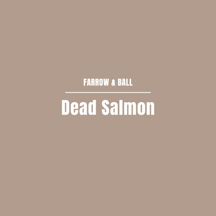
Jenny from Juniper Home is one of my favorite designers to follow. l love this warm pink paint color she used in her office powder room called Dead Salmon by Farrow and Ball.
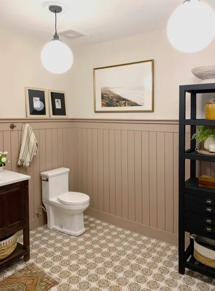
Using this beautiful color in a smaller bathroom really warms up the space and gives it personality.
*For more pinky-beige color options, check out my roundup of 16 beautiful mauve paint colors and a color review on Sherwin-Williams Redend Point paint color.
Inchyra Blue by Farrow & Ball
LRV 12
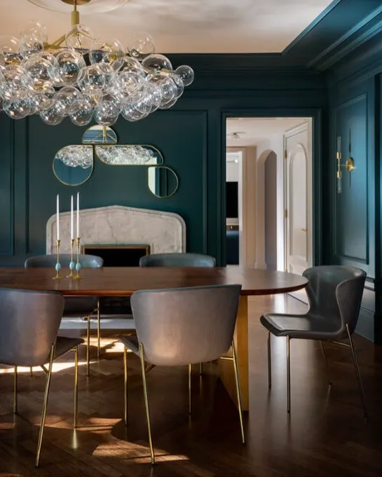
I get so much inspiration from JH Interior Design and I love this moody, blue-gray dining room with Inchyra Blue by Farrow and Ball. Inspired by the dramatic Scottish skies, this moody shade is a great alternative to charcoal if you are looking to add jewel tones to your home.
Brinjal by Farrow & Ball
LRV 4

Brinjal takes its name from the beautifully deep and shiny skin of the aubergine. This moody tone instantly adds a touch of opulence and sophistication to any space. Dark shades like this are great for an accent wall as well.
Chimney by Behr
LRV 8

Jenni from I Spy DIY created the most luxurious bathroom using this deep blue paint color. She is another designer who I often look to for bold, paint colors in the home. Chimney by Behr is a pretty gray that works well with any design style.
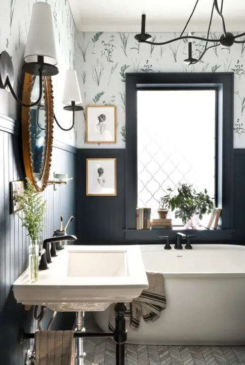
I love how this bathroom has a vintage vibe while still keeping a modern design.
Yellow Flash by Benjamin Moore
LRV 54
Yellow is one of those scary paint colors that has always intimidated me!
It probably stems from when my mom and I decided to paint the kitchen yellow and it ended up looking like the inside of a Waffle House, but Yellow Flash by Benjamin Moore is calling my name.
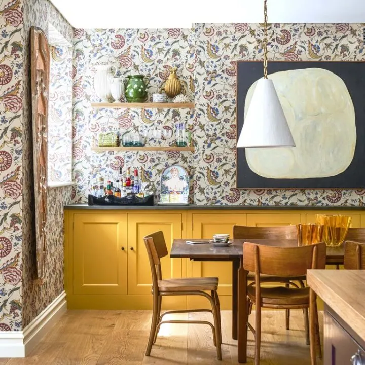
This dining room was featured in House Beautiful and the golden paint color on the kitchen cabinets is giving off major vibes of the autumn season. It looks stunning with the bold, patterned wallpaper, too! Interior designer, Rita Konig, can do no wrong in my book.
Hale Navy by Benjamin Moore
LRV 8

Hale Navy by Benjamin Moore is a favorite dark hue to use in small rooms. Deep navy is a classic and timeless color that can instantly add a sense of depth and sophistication to any space.
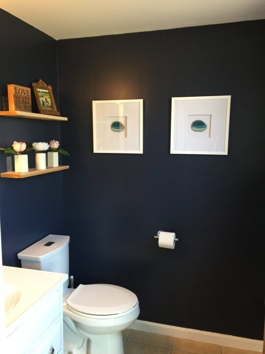
I used this dark paint color in a small half bathroom and it was the perfect, moody paint color to give this small space some oomph. It pairs beautifully with white trim and gold hardware for a nautical or regal look.
I tested Hale Navy on the walls of our master bedroom but decided to go with Outerspace which had more gray undertones.
Greenblack by Sherwin Williams
LRV 4

Greenblack is a cool black color with green undertones. Shae from Studio McGee designed this stunning all-black office in their home. With a lot of natural light, dark colors like Greenblack are a great choice for a statement wall or the whole room.
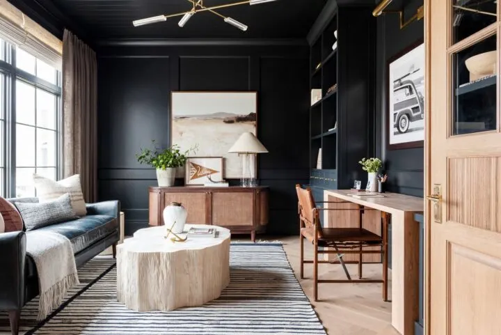
Greenblack SW 6994 is the perfect neutral base color to design this warm and inviting office.
I love the wall color with the rich, wood tones included in the room and the velvet couch.
Cavern Clay by Sherwin Williams
LRV 20

Hannah from Blank Slate Reno designed this master bedroom perfectly around the color Cavern Clay SW 7701! This terracotta color has warm undertones that pair perfectly with bohemian decor.
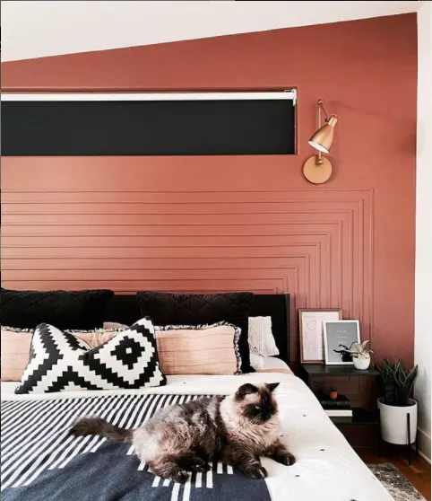
Fun Fact: Cavern Clay was also chosen as the color of the year in 2019.
Narragansett Green by Benjamin Moore
LRV 9

Narragansett Green, by Benjamin Moore, is a dark green that is part of their Historic collection that can give any space a timeless look.
Dark greens are a versatile moody paint color that brings the beauty of nature indoors. This deep and rich shade adds a sense of tranquility and sophistication to any space when applied to interior walls.
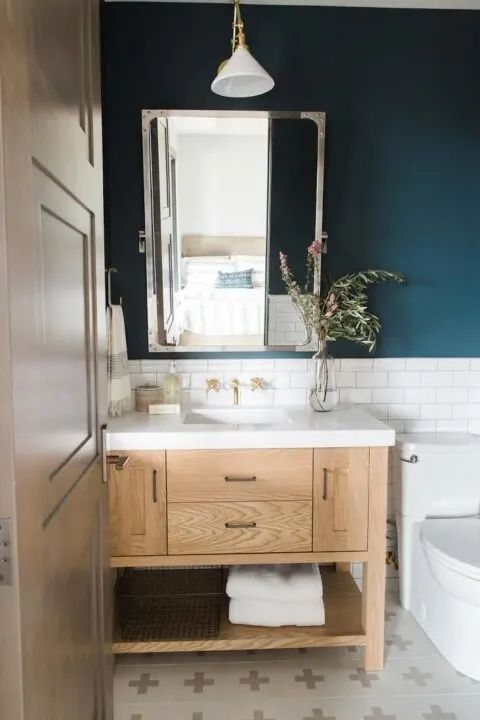
Whether you use it on the walls, furniture, or as an accent color, dark forest green creates a calming and inviting atmosphere. It pairs well with natural materials like wood and stone, as well as with earthy tones and neutral colors.
Caviar by Sherwin Williams
LRV 3

These rich, moody paint colors aren’t just for the interior of your house!
Katie and Uriah from The Inspiring Investment gave this house a modern makeover by painting the exterior with a bold, black color.
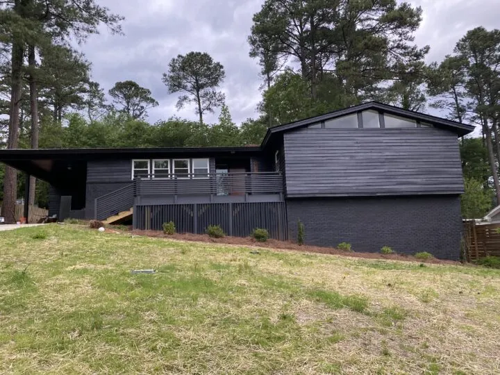
The dark exterior paint color of this home is called Caviar by Sherwin Williams. This rich black is a bold choice that pays off when incorporated into a space. While black exteriors are trending right now, Caviar is a classic neutral, perfect for mid-century modern design.
Embracing moody paint colors can transform your home into a stylish and inviting retreat. Whether you opt for the timeless charcoal gray, the calming navy blue, or the richness of aubergine, these colors can add a sophisticated touch to any space.
Remember to balance rich colors with light and complementary decor to create a harmonious and welcoming environment. Happy decorating!
Tips for Using Moody Paint Colors
1. Balance with Light
Moody colors can make a room feel cozy but can also darken a space. Balance them with plenty of natural light or strategically placed artificial lighting. Consider using lighter colors for trim, ceilings, and accessories to create contrast and prevent the room from feeling too enclosed.
2. Start Small
If you’re new to moody colors, start with smaller spaces or accent walls. Powder rooms, entryways, or a single wall in a larger room are great places to experiment with these bold hues.
3. Use Complementary Decor
Pair moody walls with complementary decor to enhance the overall look. Rich textiles, metallic accents, and natural materials like wood and stone can elevate the elegance and warmth of moody colors.
4. Consider the Room’s Purpose
Think about the mood you want to create in each room. Deep, calming colors like navy or forest green are perfect for bedrooms and living rooms, while bold, dramatic hues like black or aubergine work well in dining rooms or studies.
5. Test Samples
Always test paint samples in your specific environment to see how the colors interact with your lighting and other elements. This step is crucial to ensure you achieve the desired effect.
Similar Content You Will Love
- How to Choose the Best Interior Hues for Your Home
- Popular Farrow & Ball Colors Matched to Behr
- 15 Beautiful Gray Green Colors
- Sherwin Williams Alabaster Color Review
- I Applied Latex over Oil-Based & How to Fix
- The Best Mushroom Colors for Your Home
Commonly Asked Questions
What is Light Reflective Value (LRV)?

As a reminder, LRV tells us how much light a color absorbs on a scale from 0 to 100. The lower the number, the less light the color will reflect and will therefore feel darker.
The higher the LRV number, the more reflective the color, making a space feel lighter and brighter.
How do you make a room feel moody?
Here are a few additional ways to create a moody and cozy vibe in a room:
- Choose a rich, moody color like the examples above for the walls
- Add lamp light – Light from lamps always feels cozier than overhead lighting in a room
- Layer rich textures – Include fabrics like velvet and boucle to add dimension to the room
- Paint the trim and ceiling a moody color – Consider painting the trim and ceiling the same color as the walls
Where should I use a moody paint color in my home?
Muted paint colors can be used in any room of the home, but I would consider how you want that room to feel and function. These darker colors can easily create a cozy atmosphere so they work great in bedrooms, living rooms, and dining rooms.
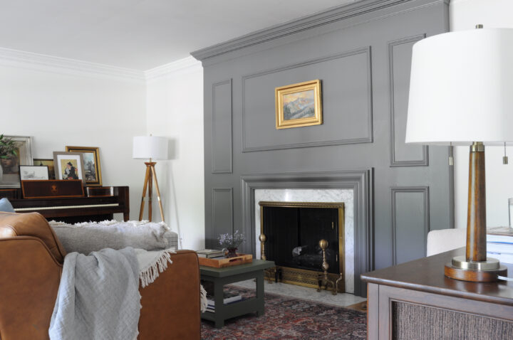
Moody paint colors are also great for accent walls. We used a dark gray color to make our living room fireplace pop!

25 DIY Wall Painting Ideas | SawsHub
Friday 21st of January 2022
[…] Visit for aesthetic guides: www.buildingbluebird.com […]