
Last Updated on September 19, 2024 by lindseymahoney
With the rising popularity of English designs and cottagecore trends, mauve has become an increasingly popular paint color. Mauve walls are finally releasing us from the chokehold that millennial pink has had on us for the last decade!
To prevent this muddy pink paint color from feeling dated (very popular in the 80s), I prefer more muted mauves that can easily be used as a neutral paint color within a space.
The color mauve has been on my brain lately because I am planning a vintage-inspired makeover for my daughter’s bedroom.
Unsurprisingly, my 5-year-old has requested pink walls and I am determined to find a dusty pink that she will love when she is 5 or 15 years old!
I have pulled together a bunch of my favorite colors in the dusty pink category for you to check out! If you are looking for a similar paint color, I know you will find a fabulous option in the round-up below.
16+ Best Mauve Paint Colors Interior Designers Love
What is the color mauve?
Mauve is in the purple color family.
There are many different versions of mauve depending on if it is a tint, a shade, or desaturated. Mauve tends to lean more pink or brown.
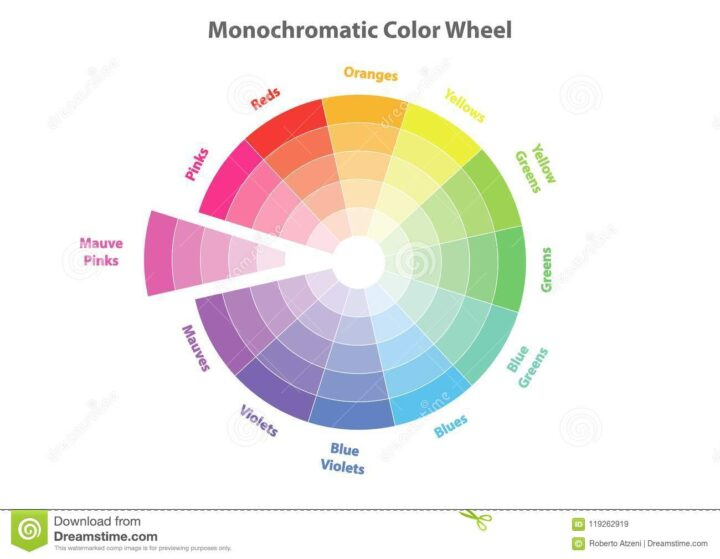
While it is an excellent choice for a neutral backdrop paint color, it can also be used to bring youthfulness or femininity to a space.
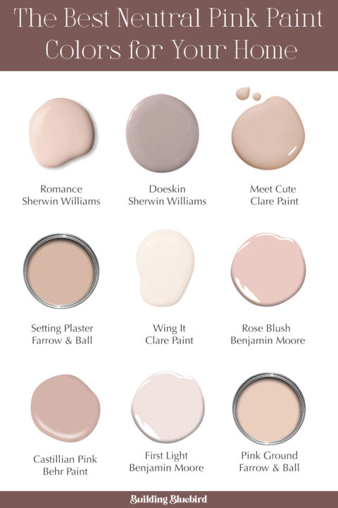
1 | Setting Plaster by Farrow & Ball
LRV 57

I have saved and pinned this image dozens of times and am in love with this beautiful, dusty pink!
This master bedroom is a design by Heidi Cailler and in my eyes, she can do no wrong. This paint colour is named after freshly plastered walls and the yellow undertones in this pink give it that warmth and total English cottage vibes. It looks great when paired with other earth tones throughout the space.
2 | Seaside Sand by Benjamin Moore
LRV 36

Benjamin Moore describes this color as a deep, dusty mauve that verges on a neutral beige.
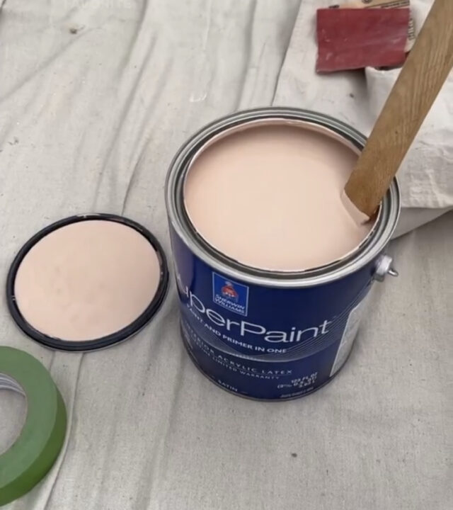
3 | Pink Shadow by Sherwin Williams
LRV 58
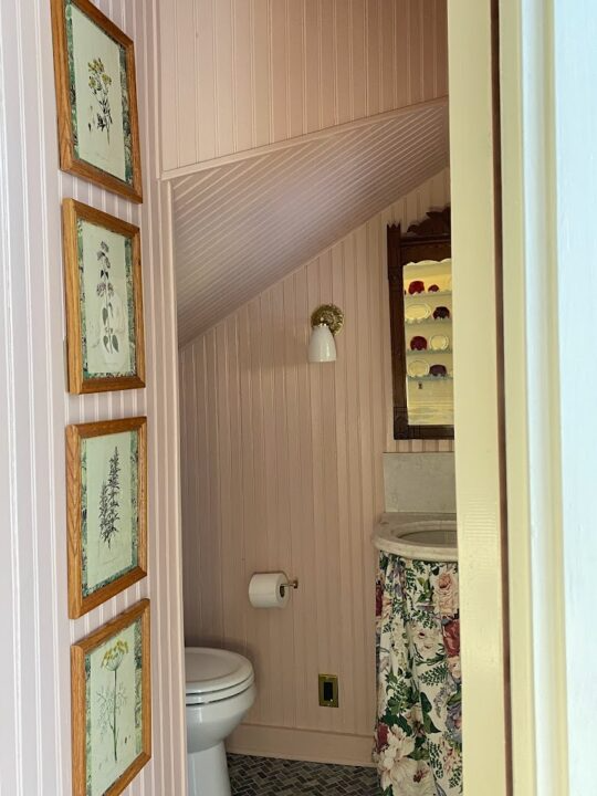
This pale pink powder room by Park and Division is a dream! Pink Shadow is part of the Sherwin-Williams Company Historic Collection and it is such a beautiful choice for this small bathroom. The soft pink pulls in the pinks of the sink skirt and pairs perfectly with the artwork.
4 | Dead Salmon by Farrow & Ball
LRV 35

Another Farrow and Ball paint color that constantly catches my attention is Dead Salmon.
This warm, chameleon color changes from dusty pink to beige depending on the time of day and lighting. It is a beautiful neutral that is lovely in a dining room surrounded by candlelight.
5 | Foggy Mauve by Valspar
LRV 33

Another deep mauve color option with gray undertones. Foggy Mauve is a cooler color that can look really striking on interior walls.
With a light reflectance value in the low 30s, this color does not reflect much light and will feel even darker in a room without much natural light.
6 | Chippendale Rosetone by Benjamin Moore
LRV 49

Chippendale Rosetone is a part of Benjamin Moore’s Historical Color collection.

This warm mauve has a vintage vibe while feeling sophisticated and timeless. Although the inspiration for this color comes from historic homes, you can easily incorporate it into traditional or contemporary designs.
7 | Purple Mauve by Behr
LRV 26

If you are looking for a deeper mauve color, this one may be for you. On the color wheel, Purple Mauve leans closer to purple/blue which makes it a cooler color.


When you desaturate a bold color like purple, it grounds the color and can create a moody vibe.
8 | Doeskin by Sherwin Williams
LRV 47

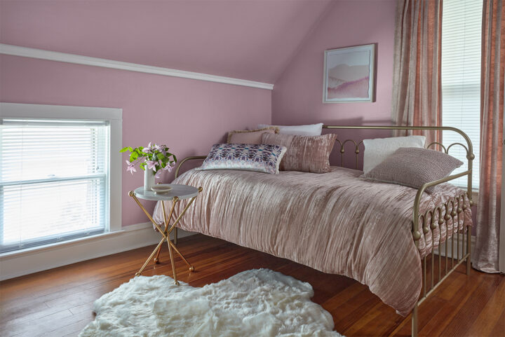
This muted mauve has gray tones and looks a little more purple in certain lighting. I actually tested this color in my daughter’s bedroom and it leaned a bit too purple for what I was looking for.


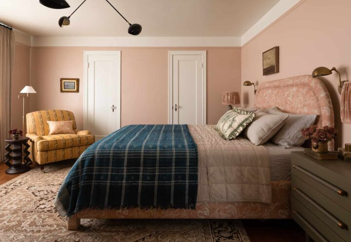
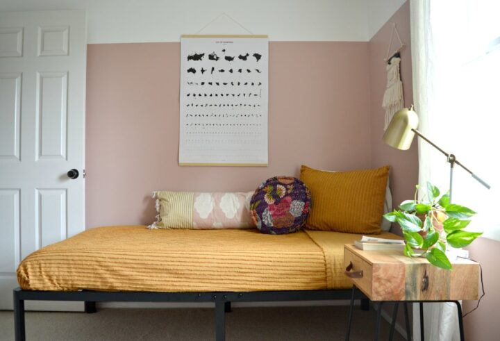
9 | Sherwin Williams Likeable Sand
LRV 50

This light mauve paint color is very similar to Setting Plaster by Farrow and Ball they were the top picks for my daughter’s bedroom makeover.
In the end, Likeable Sand was the perfect color! It works so well in the bedroom and feels like a warm hug with lamplight at night.
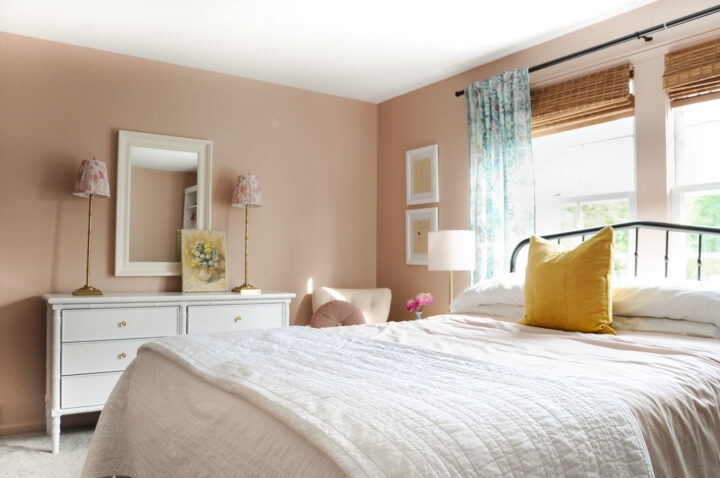
The bedroom is south-facing so it gets lots of sun during the day. This paint color is a bit of a chameleon as the light changes looking more pink in the morning and more beige at night.
To tone down all of the warm colors in the room, I added some cooler blues to the curtains and desk. Blue and pink is a great color combination and the perfect balance in a small space like my daughters bedroom.
10 | Pink Ground by Farrow & Ball
LRV 72

I don’t think I have seen this color in a room and NOT loved it. Pink Ground is a stunning blush pink that feels feminine without the frills.


Warm woods, scalloped furniture, and perfect pattern choices complement this pink paint color. Pair this pink neutral with a warmer white instead of a stark white, to create a welcoming and warm aesthetic.
11 | Behr Castilian Pink
LRV 49

Here is another example from Style Mutt Home that proves pink is the new neutral and the perfect choice for bedrooms.
This pink is actually a light shade of red-orange and looks lovely paired with the upper white wall.
Red is considered a warm color, which creates a cozy atmosphere, while the addition of black and gray pigment (shade) tones the color down to create this neutral pink.
12 | Dusty Lavender by Valspar
LRV 37

This color is a rich, smoky lavender with cool undertones and Valspar’s pick for color of the year in 2021.
Leaning more toward the purplish gray color of mauve, this desaturated hue is earthy and feminine.
13 | Clare Paint Meet Cute
LRV 50

Meet Cute is another pale mauve that almost has an earthy, peach hue. Being part of the red-orange color family, the desaturation makes it a pink that is not “in-your-face”.
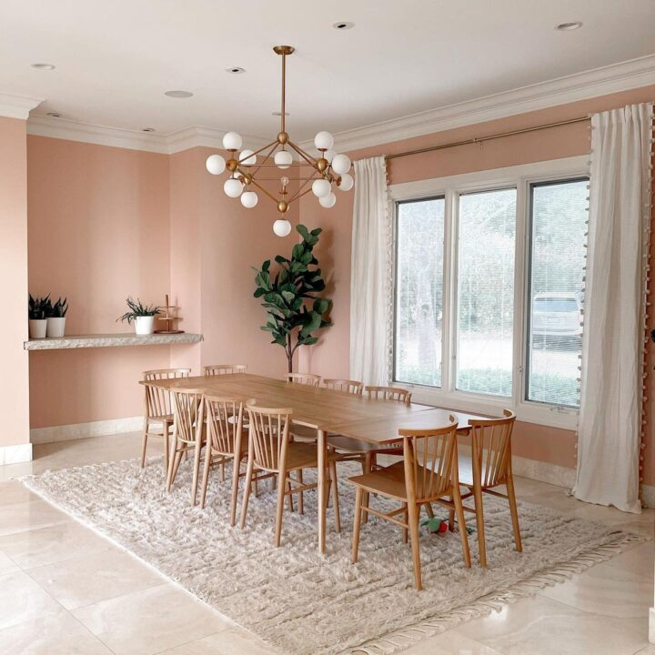
I love the neutral color scheme in this dining room with white accents and light wood furniture.
14 | Cabbage Rose by Magnolia Paint
LRV 60

Cabbage Rose is a muted, salmon pink by Magnolia Paint. Joanna Gaines chose this color for the dresser in this sophisticated girl’s bedroom.
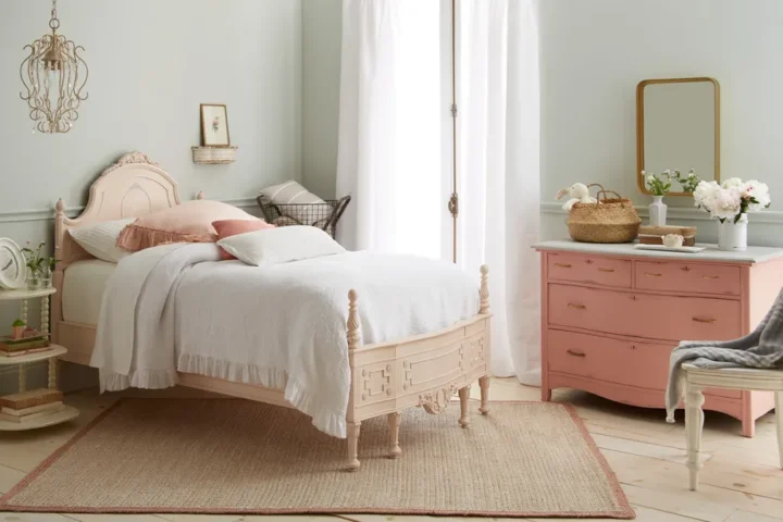
The cool gray walls and warm pink, pair very well together.
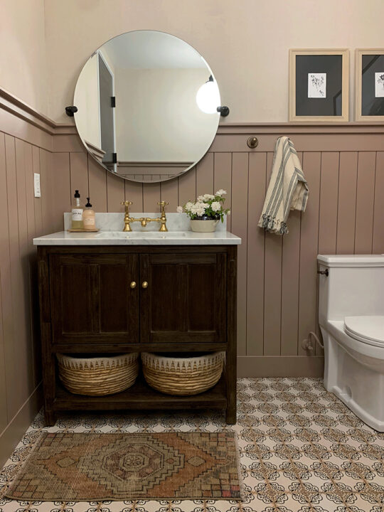
15 | Sherwin Williams Romance
LRV 66

Romance is a beautiful, dusty pink that feels feminine and mature. This popular pink was also chosen as the Color of the Year in 2020 and was one of my personal favs!
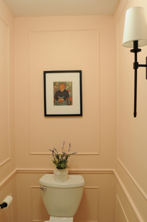
I chose this light pink color for our small, guest bathroom and am so pleased with the result! I chose a warm pink paint color to offset the blue undertones in the flower and shower tile.
The bathroom has zero natural light, so it definitely comes across as a little darker than it would in a room with windows. To tone down all of the warmth in the room, I used daylight lightbulbs overhead.
16 | First Light by Benjamin Moore
LRV 77

This pale pink is a lighter shade than most of the colors in this roundup. Honestly, this may not qualify as a “mauve” color, but it is a great option if a homeowner is looking for a sophisticated, neutral pinky purple.
This rosy hue brings a freshness to a room that looks sophisticated with black accents.
17 | Mauve Madness by Glidden
LRV 24

Mauve Madness is a desaturated pinkish-red color, which I classify as more of a darker shade of mauve. With the gray undertones, this romantic rose hue is striking without being overpowering.


More Dusty Pink Paint Colors to Check out:
- Farrow & Ball’s Sulking Room Pink
- Make Mine Mauve by PPG Industries
- Benjamin Moore’s Almond Beige
- Sherwin William’s Studio Mauve
There are many different shades of mauve look stunning on the interior and exterior of your home. I hope the paint colors highlighted above inspire you to try this beautiful color in your own space.
Happy Painting!
Looking for more Paint Color Inspo?
- Sherwin Williams Peppercorn (SW 7674) | Paint Color Review
- The Best Blue Gray Paint Colors to Try at Home
- Color Review | Sherwin Williams Redend Point
- 15 Beautiful Gray Green Paint Colors
- Best Moody Paint Colors to Try at Home
- Timeless Dark Green Paint Colors to Try at Home
- How To Choose The Best Paint Colors For Your Home
FAQs
Where can I use a mauve paint color?
Anywhere you want!
Whether it is the wall color for a guest bedroom, welcoming guests as the front door color, or used in smaller spaces like a half bathroom, it will add personality and warmth to a room.
When choosing any paint color in a room, it is important to consider the amount of direct sunlight a room gets throughout the day.
If the room is north-facing with a small window, a mauve with a higher light reflective value may be better so that it doesn’t feel super dark.
Choosing a color also depends on the design style you want to achieve. Colors with a lower LRV, like purple mauve, will work better in a room that you want to make cozy and warm.
Colors like Pink Ground with a higher LRV will make a room feel lighter and brighter.
What does Light Reflective Value (LRV) Mean?
LRV tells us how much light a color absorbs on a scale from 0 to 100. The lower the number, the less light the color will reflect and will therefore feel darker.
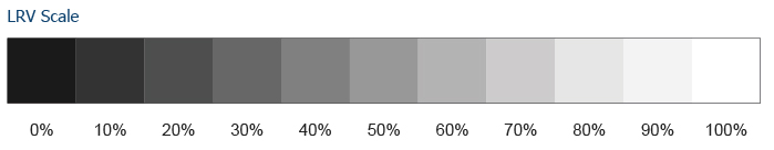
The higher the LRV number, the more reflective the color, making a space feel lighter and brighter.
Can mauve be used as a neutral?
Absolutely!
When mauve is desaturated with gray, it is the perfect neutral for a variety of styles and designs.
Whether it is more of a purplish blue mauve or pinky-orange mauve, with gray undertones, it takes on a muddy tone that is a great neutral color to use throughout a home.
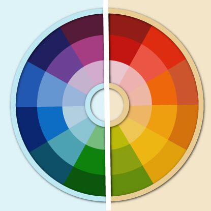
What Colors Pair Best with Mauve?


If you choose colors with a similar saturation, you can pair mauve with any color on the color wheel. Complimentary colors are the colors across from each other on the color wheel.
A mauve color that leans more purple will pair well with an earthy green. Evergreen Fog, by Sherwin Williams, is a beautiful warm green color that pairs well with muted pinks.
A mauve paint color that leans more red will pair well with cooler colors like blues or blueish greens. Sea Salt, by Sherwin Williams, is a nice blue green paint color to consider pairing with warmer pinks.
Creamy white paint colors, like Eider White, are always a great choice to pair with mauve.
Is mauve a cool or warm color?

Mauve falls in the purple color family which classifies it as a cooler color.
Because my definition of mauve is a bit looser where it can lean closer to the red color family as well, it can also be a warm color.
The mauve colors that look more beige or pale pink have warmer undertones. The mauve colors that look more purple will have cooler undertones.
What is a dusty mauve?

Whenever I use the adjectives dusty, muddy, earthy, or muted – it basically means there are gray undertones and it has been neutralized.
What is the history of mauve?
Historically, purple has been a symbol of royalty and wealth.
Before the accidental discovery of the color mauve in the 1850s, any color that did not derive from a natural material was very expensive to create.
The color mauve could be created chemically at an inexpensive price and it became incredibly popular with its availability to the general public.
What does the color mauve symbolize?
As I mentioned above, the colors in the purple family symbolize wealth, royalty, and abundance. Mauve can also symbolize femininity and youthfulness.