
Last Updated on June 11, 2023 by lindseymahoney
Are you someone who follows the anticipated paint color trends each year? I love when big paint brands choose a color of the year and find fascinating the thought that is put into each decision.

Last year there were mixed reviews with the Sherwin Williams choice of Cavern Clay but I feel like 2020 has all crowd-pleasers!
Here is a roundup of the paint color trends to expect in 2020.
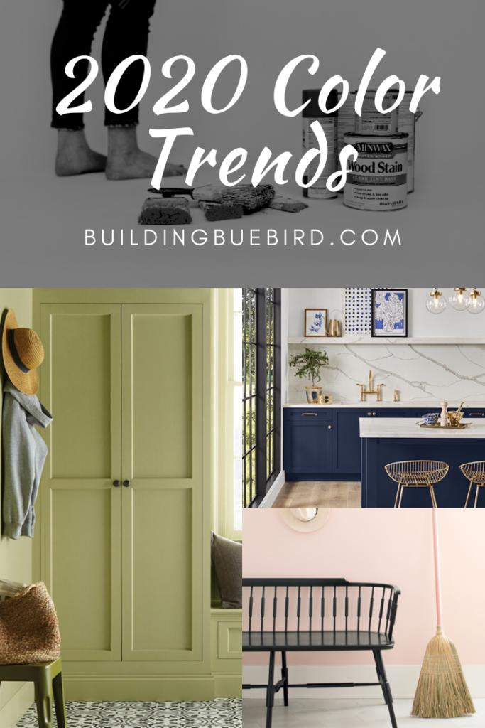
2020 Paint Color Trends
2020 is the start of a new decade and that does not seem to be lost on these paint brands.
There is a common theme of renewal and calm with each color of the year. Blue and green hues dominate the 2020 paint color trends and I am not mad about it!
I love deep blue and earthy green and the pink/blush trends. I must admit, I am still not over the Millennial pink trend and these pinky hues are just what I need in my 2020 color wheelhouse.
Pantone | Classic Blue
This pretty, tranquil blue can easily be used to anchor a space.
Pantone puts A LOT of thought into the colors they choose each year and the explanation of why Classic Blue was chosen for 2020 is fantastic. Looking to start fresh in this new decade? Consider adding Classic Blue to your home.
Instilling calm, confidence, and connection, this enduring blue hue highlights our desire for a dependable and stable foundation on which to build as we cross the threshold into a new era.
Pantone
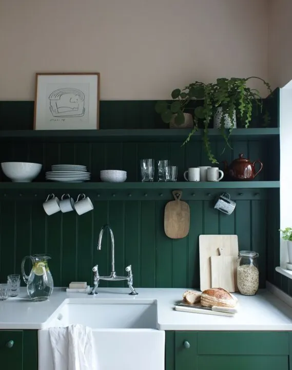
Behr | Back to Nature
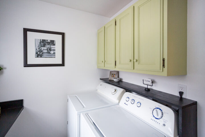
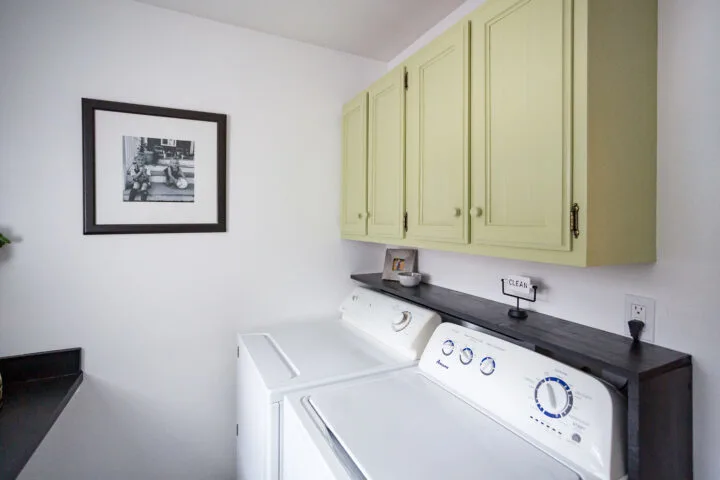
Behr’s 2020 color of the year is Back to Nature.
This is a beautiful, earthy green that goes great on walls, cabinets, and even the exterior of your home! This color pairs well in a space with natural elements like plants and neutral colors found in nature.
Check out their full 2020 color palette, they are beautiful!

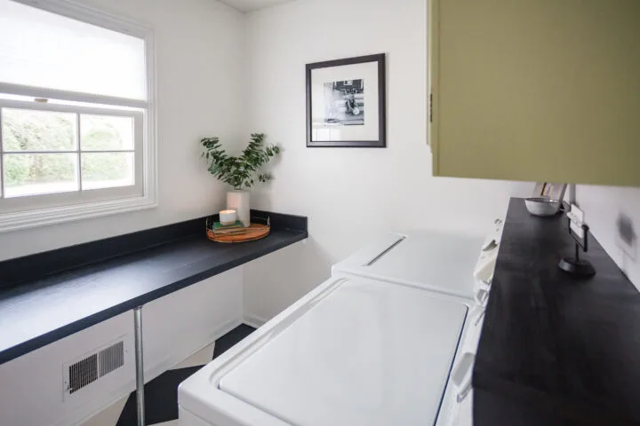
I used this color on my cabinets when I renovated my laundry room for under $300. This beautiful green brought in the earth tones I was looking for while achieving the modern look in the space.

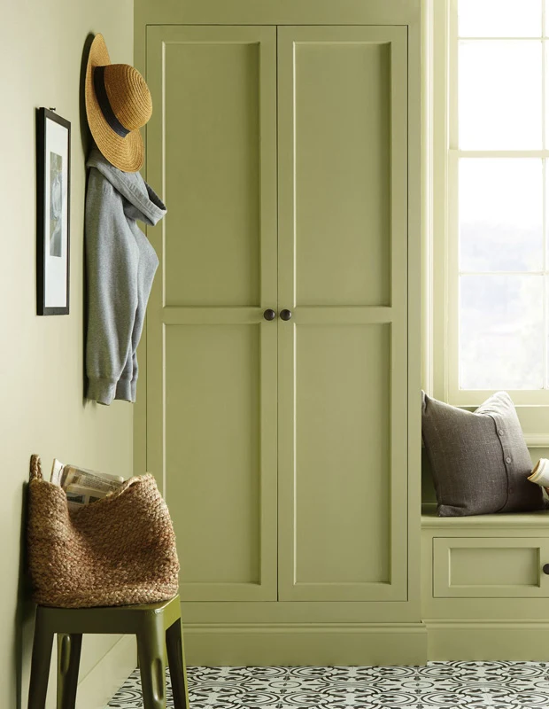
Here is the same earthy green on cabinets.
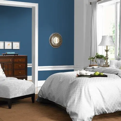
Sherwin Williams | Naval
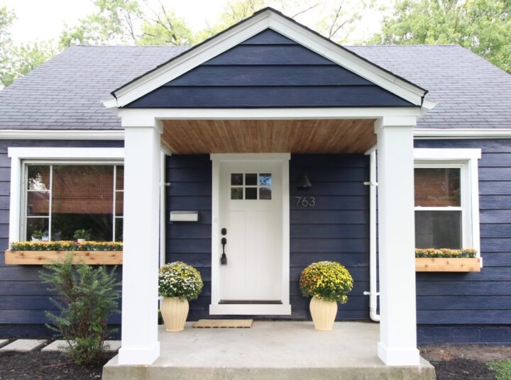
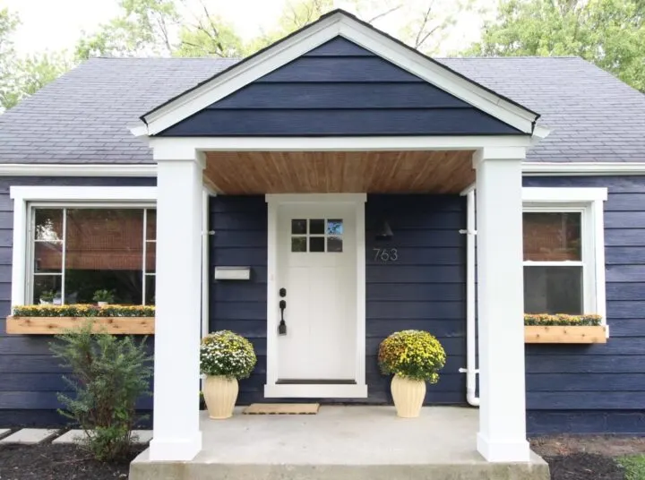
Sherwin Williams follows the theme of nature with its color of the year choice.
I love reading the story behind the paint color choice and what it represents and how color can make you feel. This bold color easily becomes neutral in a room.
Dark, bold hues like Naval are great for making a big statement in smaller spaces. Try painting a small half bathroom in this color or the ceiling of a bedroom!
It also looks amazing on the exterior of a home. Beginning in the Middle used this color on one of their flips and it is stunning!
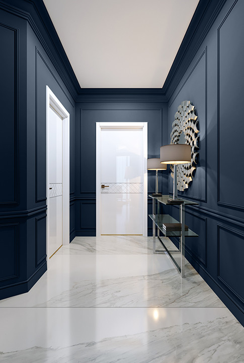
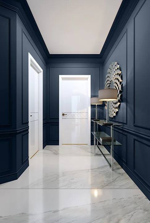
This bold hallway is really unique and eye-catching.
Benjamin Moore | First Light
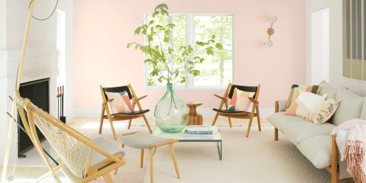
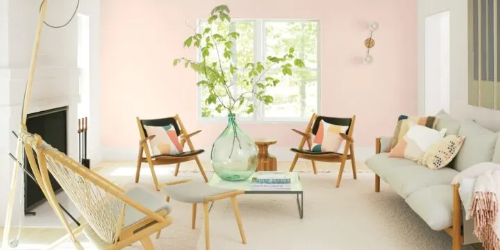
I love this soft and airy pink!
First Light is the perfect pink neutral to put on walls and grow into over the years. Check out their full 2020 color palette that showcases 10 paint color trends.
A fresh palette. A revitalized spirit. A soft, rosy hue blooming with potential. Benjamin Moore’s Color of the Year 2020, First Light 2102-70, is the backdrop for a bright new decade.
Benjamin Moore
Farrow and Ball | Duck Green

Duck Green by Farrow and Ball is a timeless dark green color that feels fresh for the new decade ahead.
Joa Studholme, the color curator for Farrow and Ball, chose the 2020 colors that are warm and welcoming to friends and family. With this in mind, she chose bolder colors that were more saturated, like Duck Green.
HGTV Home by Sherwin Williams | Romance
Romance is another beautiful pink as well as the perfect neutral.
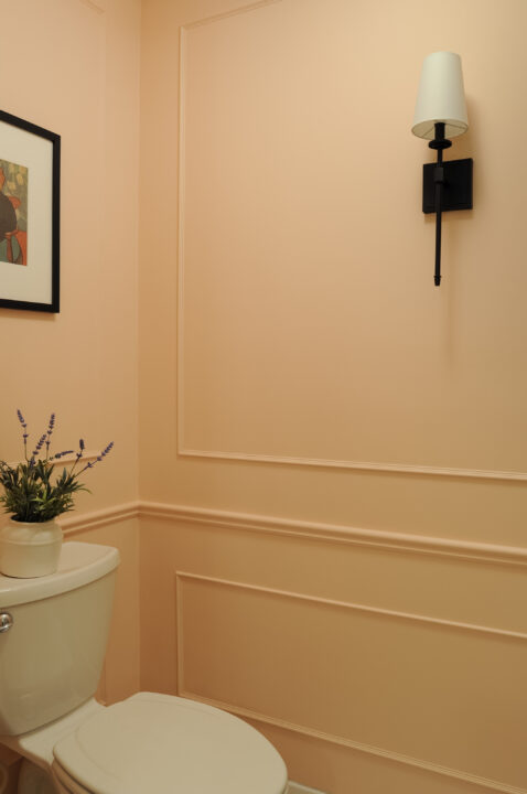
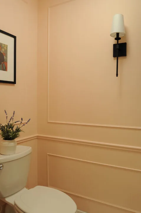
While planning our guest bathroom makeover, I decided to use Romance in the small toilet/shower room and it looks beautiful. For added interest, I DIY’ed a decorative wall treatment in the small room with picture frame molding.
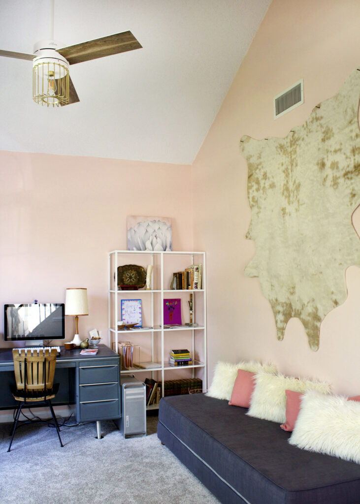

Julia from Tag and Tibby used this color in her office and I love the calming effect it gives the space! Pale pink has long been a paint color trend so I am not surprised that it made the list for 2020!
Graham & Brown | Adeline

Some describe the Adeline paint color as “oxygenating”.
The jewel-toned green brings the outdoors in with this beautiful green color. Similar to the deep navy and blues, this bold green is a great anchor for a space and can easily act as a neutral.
Dunn-Edwards | Minty Fresh
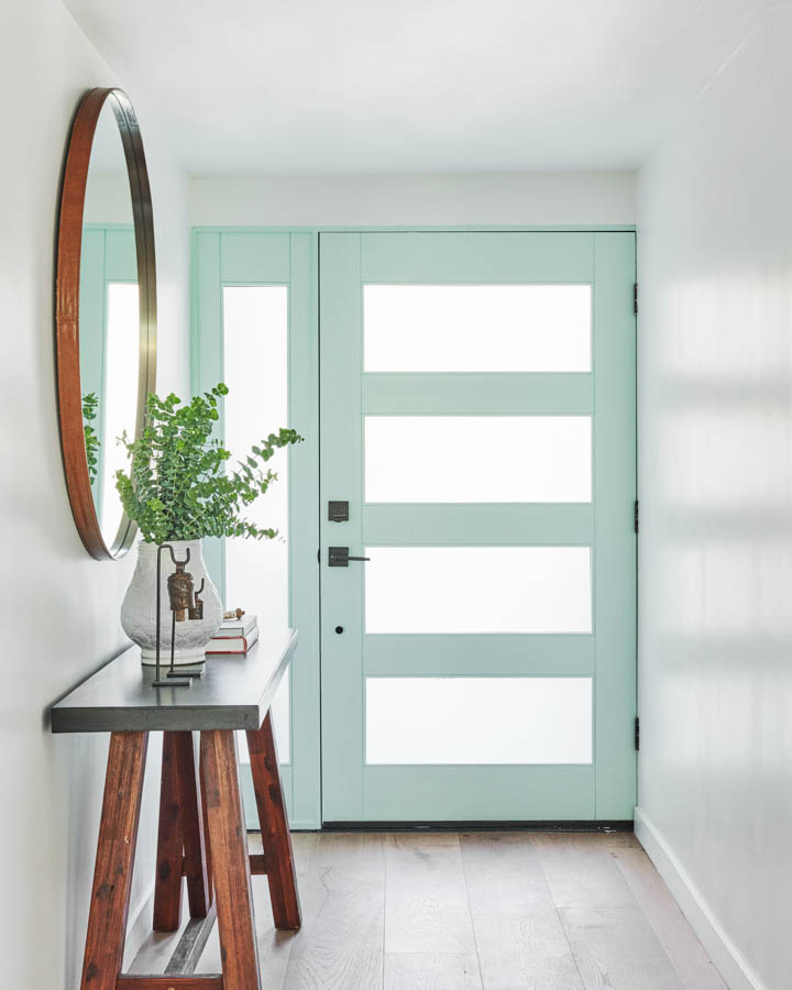
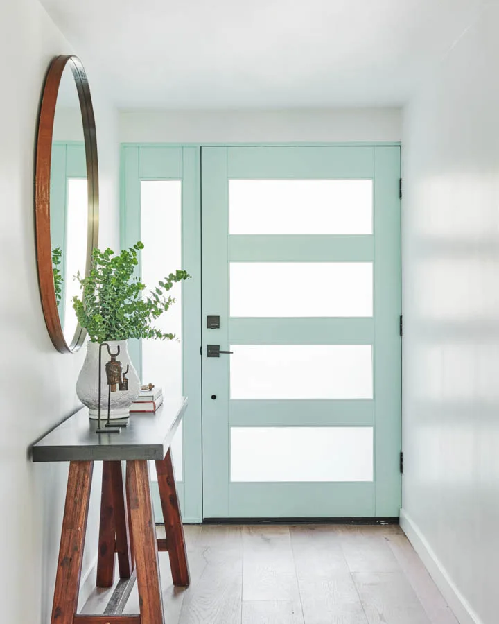
Dunn-Edwards describes Minty Fresh as calm that reflects purity and new beginnings. Perfect for a new decade!
This color is really really refreshing and would look great in a bathroom to give it that spa-like feel.
PPG | Chinese Porcelain

PPG chose this color to represent calmness in a restless world.
Many of these brands actually chose colors that represent a sense of calm in a world where technology is everywhere and anxiety is high. Chinese Porcelain brings calmness and restful sleep while also reflecting hope as we enter a new decade.
Color is so powerful! I love its ability to create a mood and pull emotions simply by the color on the walls.
I have to admit, I never chose paint colors with this idea in mind before and I am so excited to start now! What home projects are you thinking of right now where you can add one of these 2020 paint color trends? I will definitely be adding some to my home this year!
More Paint Color Content You Will Love
- 2022 Paint Color Trends to Expect in the New Year
- Sherwin Williams Alabaster Color Review
- Rich, Moody Paint Colors For Your Next Project
- 2021 Paint Color Trends | What to Expect This Year
- The Best Greige & White Paint Colors for Your Home
- I Applied Latex Over Oil-Based Paint | How to Fix
- The Best Supplies for Painting Interior Spaces
Paige
Wednesday 6th of May 2020
Try nimbus or nimbus cloud for the grey house color
lindseymahoney
Thursday 7th of May 2020
Thank you for the recommendation!
Kelli
Monday 20th of April 2020
Beautiful paint colors! Any idea what color gray is on the house with the blue door?
lindseymahoney
Tuesday 21st of April 2020
I am not sure of the gray color on the house! You could probably get pretty close if you brought it to a paint store and asked them to help color match.
Kelli
Monday 20th of April 2020
Beautiful paint colors! Any idea what color gray is on the house with the beautiful blue door?