Last Updated on November 19, 2024 by lindseymahoney
Choosing the perfect paint color for your home can be overwhelming! With endless paint color options and unlimited inspiration on Pinterest, it is easy to get decision paralysis when choosing a paint color for your home. Today I am sharing my favorite blue green paint colors for you to try in your home. The right blue-green shade has the ability to transform any space in your home into a serene space that reflects your personality.
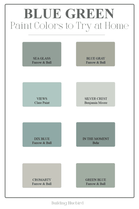
Table of Contents
- Why choose a blue-green paint color?
- 16 Beautiful Blue Green Paint Colors to Try at Home
- Sherwin Williams Sea Salt
- Benjamin Moore Silver Crest
- Sherwin Williams Rainwashed
- Benjamin Moore Beach Glass
- Sherwin Williams Comfort Gray
- Benjamin Moore Palladian Blue
- Benjamin Moore Wythe Blue
- Kilz Magnolia Weekend
- Claire Paint Views
- Farrow & Ball Green Blue
- Farrow & Ball Blue Gray
- Farrow & Ball Cromarty
- Glidden Silver Maple
- Behr In the Moment
- Farrow & Ball Dix Blue
- Behr Thermal
- Are you a beginner painter?
- More Paint Color Inspiration You Will Love
- Tips When Choosing Your Paint Color
- Testing Paint Samples
- Frequently Asked Questions
- Paint Projects to Try at Home
Why choose a blue-green paint color?
The mixture of blue and green creates a perfect combination that evokes a feeling of serenity, calm, and rejuvenation.
This blue-green blend is incredibly versatile and can work well in many rooms and design styles. This beautiful color is trendy yet timeless making it a popular choice with interior designers and homeowners alike.
16 Beautiful Blue Green Paint Colors to Try at Home
Here are a few of my favorites!
Sherwin Williams Sea Salt
LRV 63
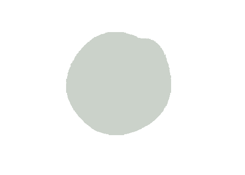
Sea Salt by Sherwin Williams is one of their most popular blue-green paint colors for interior spaces. It is a soft, muted blue-green that looks fabulous in any room of the home. This relaxing hue pairs perfectly with neutral colors and furnishings.
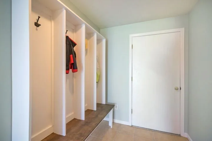
Benjamin Moore Silver Crest
LRV 70

As Benjamin Moore says, the slightest touch of green and gray adds elegance to this light blue paint color to create a sophisticated look.
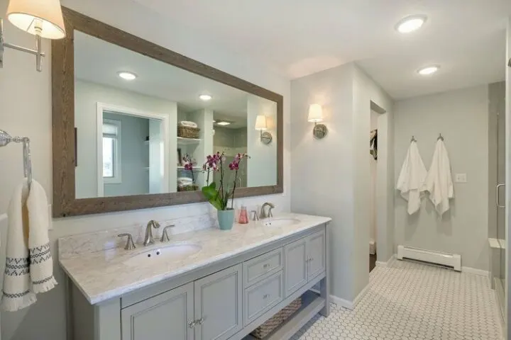
I have used this inviting green blue paint color in a few of our bathrooms and it gives each space a spa-like feel. Add crisp white linens and it totally completes the look!
With an LRV of 70, this is a great paint color for windowless rooms or a small space, like a bathroom. It reflects more light to create an open and airy feel.
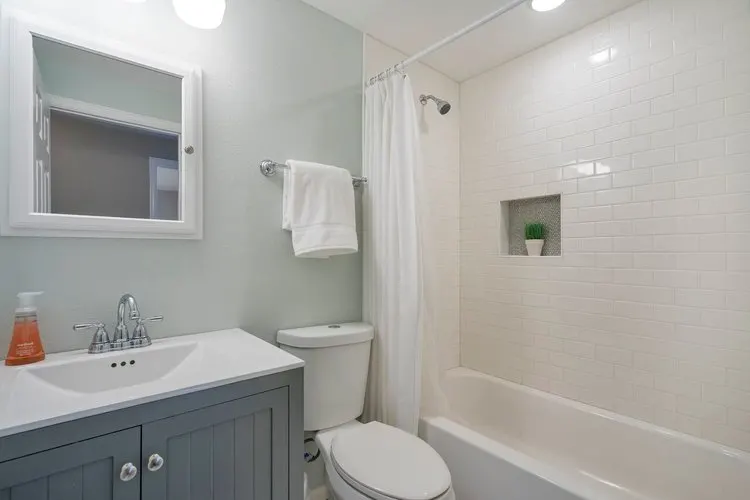
*Bottled Glass, by Valspar is the exact color match to Benjamin Moore’s Silver Crest.
Sherwin Williams Rainwashed
LRV 59
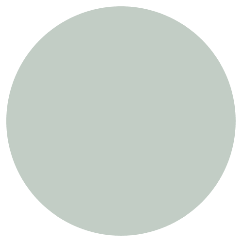
Rainwashed is a refreshing blue-green that immediately puts you at ease. It is one of the most popular color choices for bedrooms and bathrooms and looks even better when complemented with white accents.
Benjamin Moore Beach Glass
LRV 50
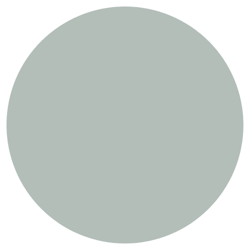
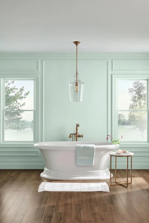
Beach Glass is part of the Benjamin Moore Classics Collection and is a cool, calming blue-green. The gray undertones make it a versatile color that looks perfect when accented with natural textures and greenery.
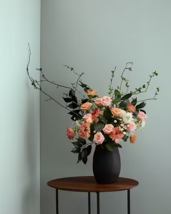
Sherwin Williams Comfort Gray
LRV 54
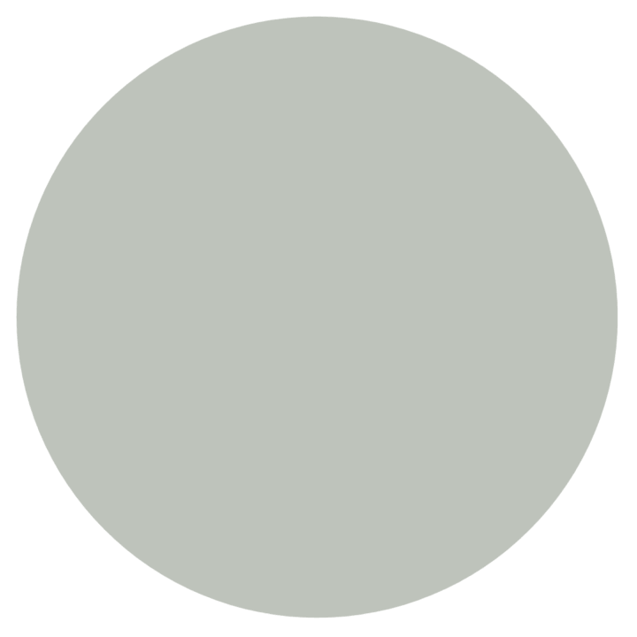
Despite its name, Comfort Gray is technically in the green color family. This grayish blue-green is a great color choice to create a tranquil atmosphere.

Comfort Gray is a popular choice for bedroom walls because of its serene feel.
Benjamin Moore Palladian Blue
LRV 60
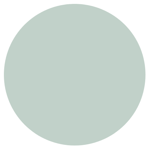
Palladian Blue is a soft, sophisticated blue-green that is said to imitate clear skies and flecks of mother of pearl. The perfect paint color for a coastal, beachy vibe. Balance this soft blue-green blend with warm neutrals.
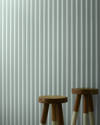
Benjamin Moore Wythe Blue
LRV 48
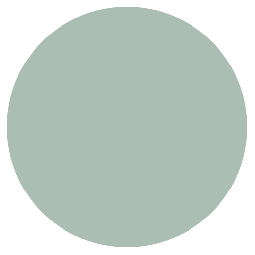
Wythe Blue (or Catalina Blue) is an easy and elegant blue-green with a hint of gray.
Because it is part of the Historical Collection, I recommend enhancing your space with antique or vintage decor.
Kilz Magnolia Weekend
LRV 7
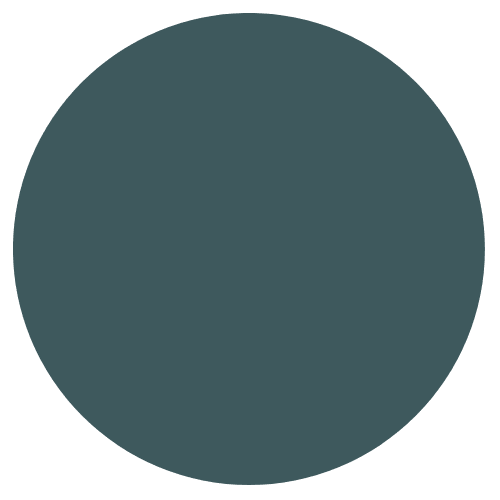
If you are looking for a bold pop of color, try adding Weekend, by Magnolia by painting a piece of furniture. Abbots at Home added this great blue green color to their entryway table to welcome guests to their home.
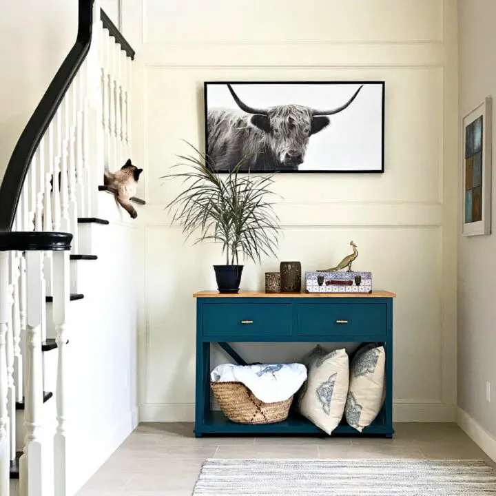
The Weekend is a beautiful dark, blue green paint color with an LRV of 7. In rooms without a lot of light, this teal hue can look almost black.
Claire Paint Views
LRV 48

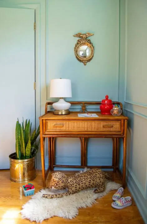
Views, by Clare Paint, is a medium blue color with a hint of green undertones.
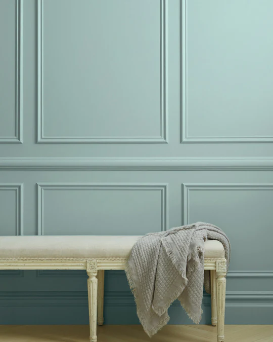
This minty, pale blue color can stand on its own when paired with bold red and warm rattan wood. It looks stunning in this corner office by Haus Matter.
Farrow & Ball Green Blue
LRV 40
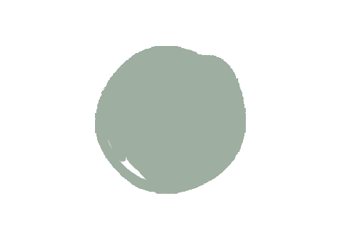
Green Blue by Farrow and Ball is the perfect blueish-green teal color. Like most blueish-green paint colors, the hue can change depending on the time of day or the amount of light within a room.

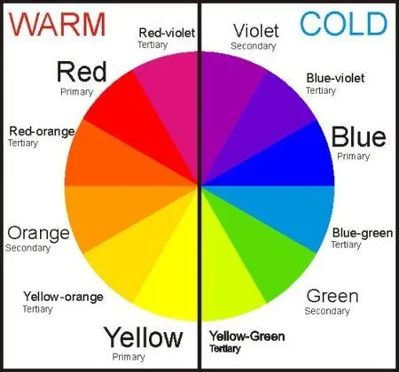
A space with a lot of natural light or a warmer color palette, the more green the paint color will look. The same paint color will look bluer in a space with less sunlight and a cooler color palette (see the color wheel at the bottom of the post).
Farrow & Ball Blue Gray
LRV 53
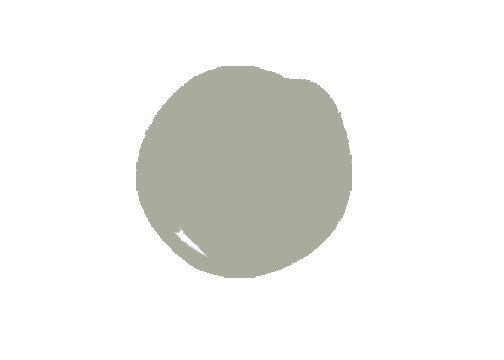
This cool blue hue is a mixture of blue, green, and gray undertones. Depending on the time of day, this color can shift from blue to a cool gray to create a relaxed and comfortable vibe.
Farrow & Ball Cromarty
LRV 60
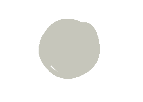
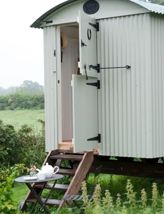
Cromarty is a beautiful greenish gray that looks light blue in spaces with lots of natural sunlight. Cromarty has the hue of a pale blue robins egg and is a great option for a soothing bedroom design.
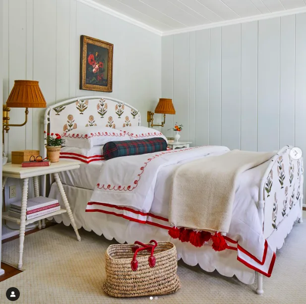
After seeing Whitney McGregor’s Airbnb bedroom with this wall color, I am considering this green-gray blend for my guest bedroom. Paired with white accents and a pop of red, this space is so inviting!!
Glidden Silver Maple
LRV 64

Another light and airy grayish green paint colour is Silver Maple by Glidden. Blue greens with a higher LRV have a fresh and soothing feel to them.
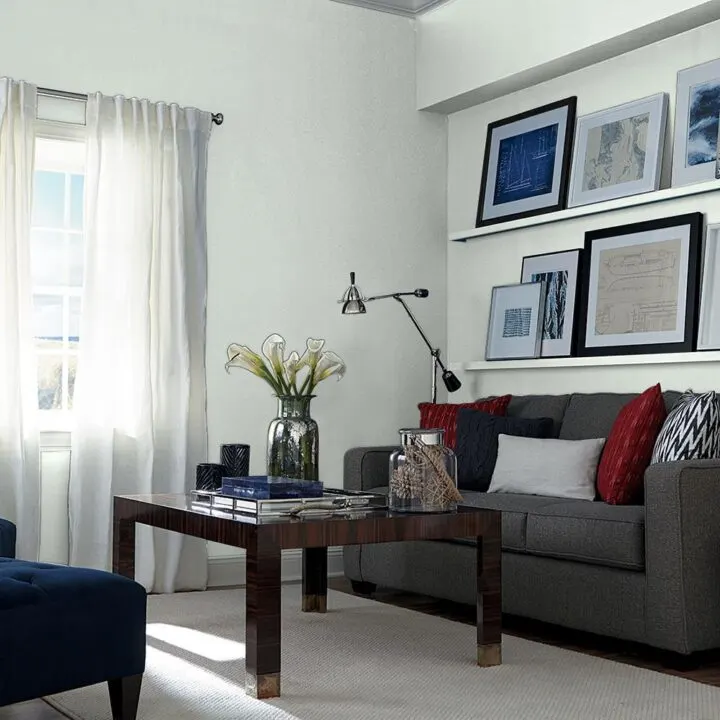
Behr In the Moment
LRV 30
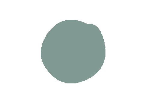
In the Moment was chosen as Behrs Color of the Year in 2017 and is a “restorative blue green hue” meant to soothe and relax.
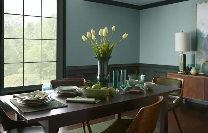
With a lower LRV of 30, this paint color will reflect less light and feel like a deeper green blue than a color with a higher LRV. It is a more saturated and vibrant color that can also bring energy and fun into a space.
If you love this color but it feels too heavy in your space, consider lightening it by 25%. This is a great option and is available at most paint stores.
Farrow & Ball Dix Blue
LRV 50
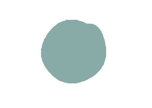
Farrow and Ball describe this color as a vintage blue. Like many of their blues, this paint color has a good amount of green mixed into it which gives it a warm and cozy feel.
Behr Thermal
LRV 7

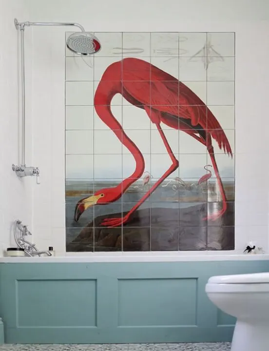
Thermal by Behr Dynasty is a deep blue-green that creates a cozy atmosphere perfect for a bedroom!
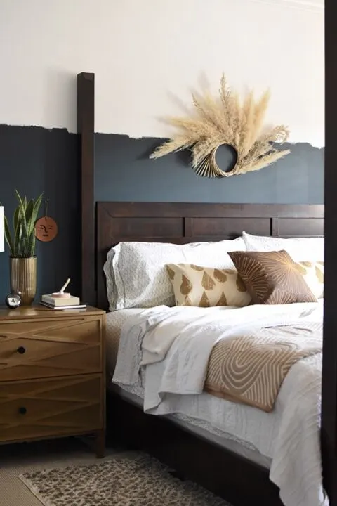
The LRV is 7, which makes this a bluish green that can look almost black when a room lacks sunlight. If you want to add some drama to a space, this is a great color to use on the walls!
*Once you finish your paint project, don’t forget to wash your paintbrushes! Check out my top tips for washing dirty paintbrushes.
There are thousands of paint colors to choose from and I hope this round-up has inspired you to make a decision on your paint color and start your new project today.
Are you a beginner painter?
Before starting your paint project, check out my list of the must-have paint supplies when tackling a DIY paint project at home!

More Paint Color Inspiration You Will Love
Check out more paint color inspiration for your home!
- Popular Farrow & Ball Colors Matched to Behr
- Timeless Dark Green Paint Colors to Try at Home
- Best Blue Gray Paint Colors
- The Best Neutral Pink Paint Colors to Try at Home
- The Best Greige & White Paint Colors for Your Home
- Rich, Moody Paint Colors For Your Next Project
- The Best Cottagecore Paint Colors to Try at Home
Tips When Choosing Your Paint Color
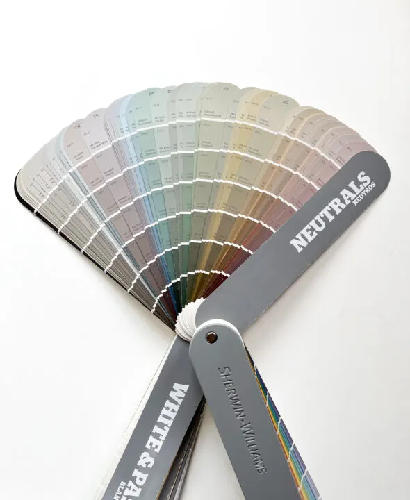
Consider the natural light in the space because it will affect the paint color appearance. In a naturally dark room, the gray undertones will show more making the blue green hue look darker than a brightly lit room.
When searching for the right hue, consider the room size and mood or ambiance you want to create in this space. For a relaxing vibe, a light and airy blue green paint color will probably be better than one of the deeper, moody shades.
Testing Paint Samples
When you narrow down your color choices to 1 or 3 options, it is important to test large swatches on your walls. Apply the paint sample on multiple walls in the room and observe the color throughout the day. The colors will change from morning to evening depending on the natural light.
I have had experiences where I am dead set on a specific paint color and then I put a color sample on the walls and completely change my mind. Don’t skip this step!
Frequently Asked Questions
Where do blue green paint colors look best in the home?
Blue-green colors look fantastic in bathrooms because of the fresh and clean feeling it creates. This blue-green paint color also looks great as an accent on kitchen cabinets. I prefer the deeper blue-greens in spaces like a bedroom or family room where you prefer to cozy up under a blanket.
Wherever you decide to add this color tone, it will bring freshness to the space without feeling too cold.
What does Light Reflective Value (LRV) mean?
LRV tells us how much light a color absorbs on a scale from 0 to 100. The lower the number, the less light the color will reflect and will therefore feel darker.
The higher the LRV number, the more reflective the color, making a space feel lighter and brighter.

What is an undertone?
A paint undertone is the color you don’t see that can cause the main color (tone) to feel warm or cool. Warm paint colors have yellow, beige, or pink undertones. Cool paint colors have green, purple or blue undertones.
Is the blue green paint color a warm or cool color?
Blue green paint colors are considered cooler colors. Check out the color wheel below.
Knowing if a color is warm or cool is extremely helpful when choosing paint colors for your home.
If a room in your house feels very cold and uninviting, adding warmer colors to the space will help to offset the cold feeling.
This can be as subtle as choosing a white paint color that has warmer undertones instead of cooler undertones. Some whites pull more yellow and some that pull more blue or pink.
My living room is north-facing and doesn’t get any direct sunlight so it tends to feel a bit cold.
I chose Alabaster White by Sherwin Williams which has a yellow undertone. The space feels warmer without looking yellow.
